Analysis, Action, and Learning: Understanding Next Steps for SEMA and Water Point Data
In addition to supporting timely data collection about water access in Tanzania, the Sensors, Empowerment, and Accountability (SEMA) network provides a public-facing District Water Engineer Dashboard.
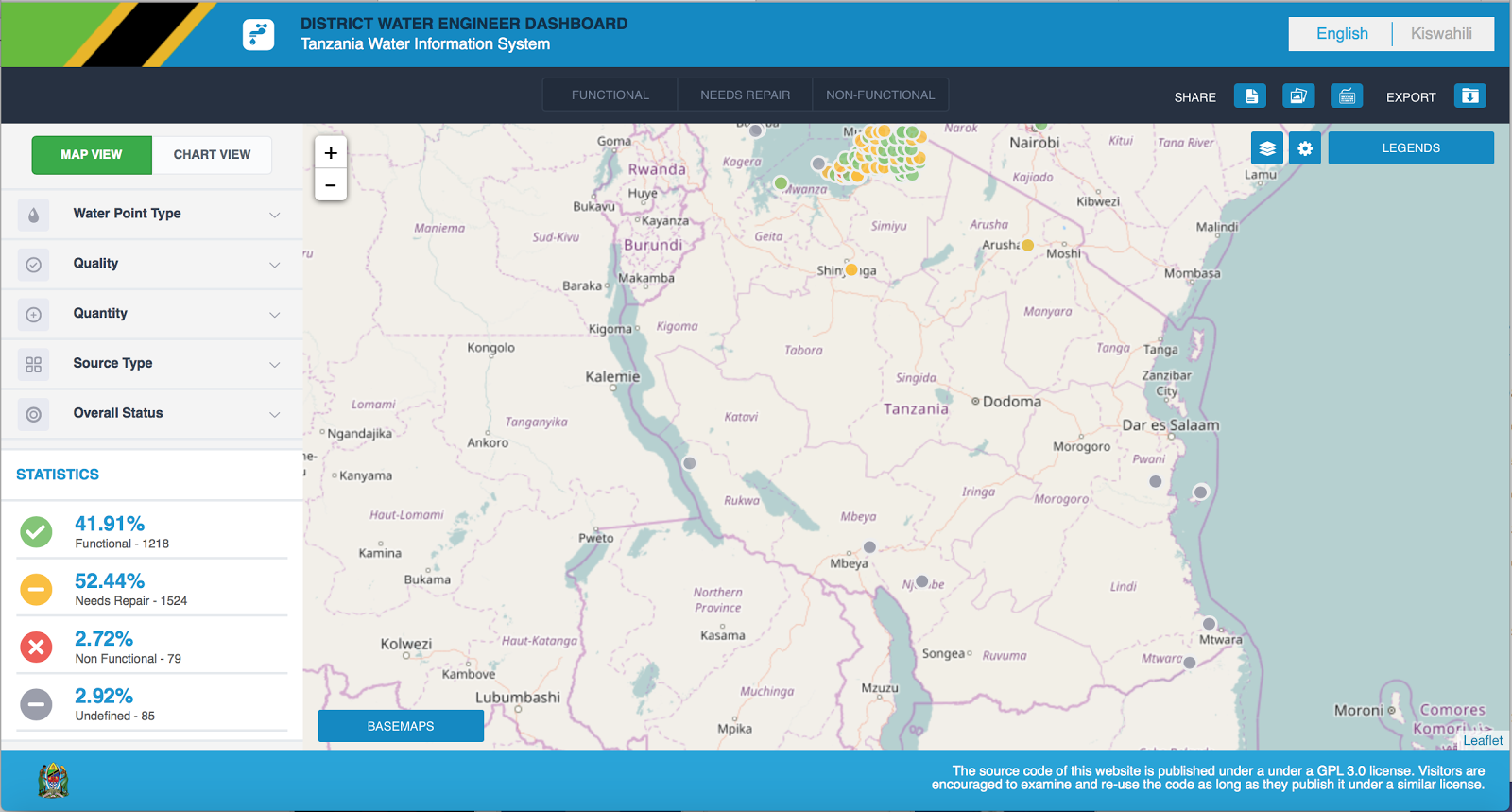
Figure 1: Screenshot of DWE Dashboard Map
This dashboard allows key audiences – citizens, District Water Engineers (DWEs), other Ministry of Water and Irrigation officials – to easily view the statuses of individual water points. Community reporters can also verify whether government receives their reports. Users further have the ability to filter by water point by type, quality, quantity, and source, either on the map or in bar chart format.
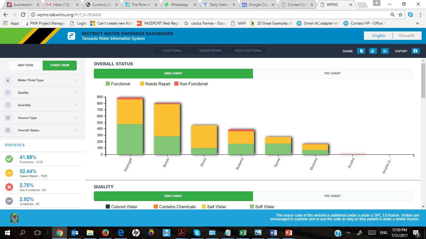
Figure 2: Screenshot of Dashboard Charts
Importantly, the mobile application is accessible also on mobile – not just to create water points (which can also occur without internet connectivity with data synchronization taking place when a connection is next detected) but also view them. This is important for users when they cannot access the desk version.
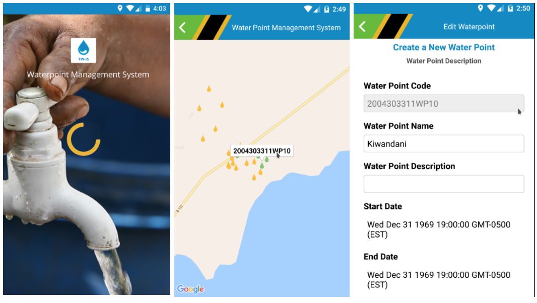
Figure 3: Screenshot of Mobile App
Importantly, the DWE Dashboard moves beyond reported data, and incorporates complex visualizations related to water coverage and scarcity calculations – key for effective government planning.
Water Coverage
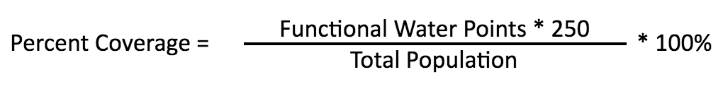
Traditionally, the Ministry computes the percentage of coverage met my functional water points using the following formula, where one functional water point is assumed to have the capacity to serve 250 people:
This visualization is included in the dashboard, but has limitations. Namely, it does not take into account distance from a village to the water point, and only considers water point functionality.
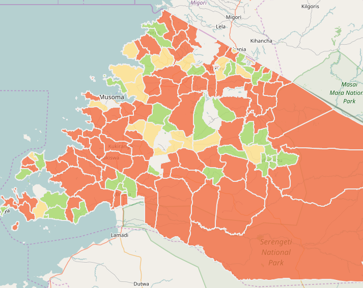
Figure 4: Screenshot of Simple Coverage
Through SEMA, we proposed an innovation on the water coverage methodology, by incorporating an external population dataset from WorldPop. This dataset provided estimates on how many people live in each square 100 meters around the world, stored in raster format.
Our team imported the WordPop data into the dashboard’s PostGIS database. We then were able to set up calculations to determine how many people each water point serves, based on distance from each point. Dashboard users can toggle the distance, from 400 to 5,000 square meters.
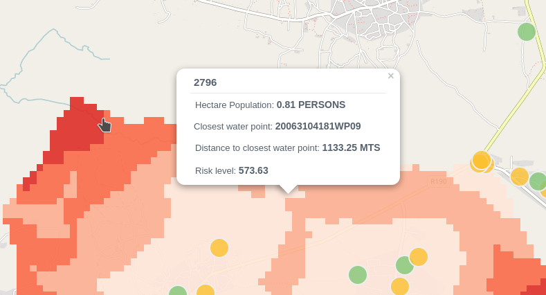
Figure 5: Population served by water point: Higher risk area since there is more population (distance is not the only factor)
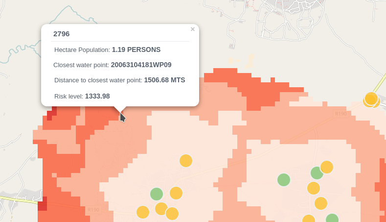
Figure 6: Population served by water point: Lower risk area (since there’s less population)
Enabling these distance-based calculations also allowed us to include visualizations of the distance between health facilities and water points – an important planning consideration for the Ministry of Water and Irrigation.
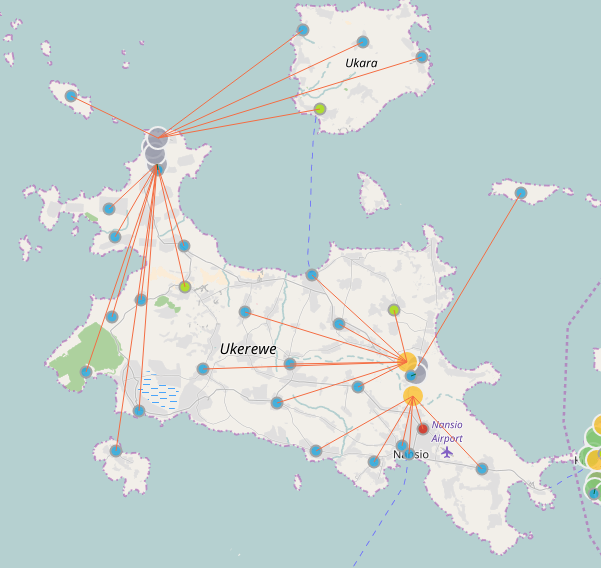
Figure 7: Health Facility Distance to Water Point
Water Scarcity
To compute water scarcity, the raster layer is cut according to the shape of the selected ward. Then, for each 100 square meter cell, the dashboard calculates the distance to the nearest water point. The risk formula takes into account distance to the nearest water point, and number of people living in the area in that cell.
The formula gives higher weight to population density, versus distance to water points. Higher risk areas have higher risk scores, and a darker red color.
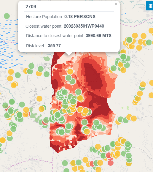
Figure 8: Scarcity Calculation
What Comes Next
To scale and sustain this work, it’s important to maintain the base technology; continue to adapt and iterate on the programmatic approach; and, finally, to identify resources for strengthening capacity and use of the system.
Fortunately, on the first point, the University of Dar-es-Salaam is an exceptionally well-positioned partner and facilitator for this work. UDSM possesses the skills needed to enhance and maintain the DHIS2 back-end, and open-source solution dashboard and application front-end; they also have deep experience and relationships with the Ministry of Water and Irrigation.
As to the second — it’s tempting to believe that, following a successful pilot, scaling is simply a matter of making the tool available to a wider audience. While the overall SEMA project has shown promising outputs in terms of real-time monitoring, additional government resources are likely to be needed in order to sustain and scale the program. Scaling up in phases, with adjustments/revisions based on feedback from DWEs, will reinforce gains that lead to overall success.
Finally, we anticipate that additional resources will be needed to support training and capacity strengthening for additional DWEs and community reporters. As the system becomes further populated with data, it can become a stronger mechanism for community feedback; and an evidence base for ministry planning and response; and a resource for smarter, needs-based investments in Tanzania’s water sector.
Dr. Juma Lungo is a lecturer and researcher at the University of Daresalaam, and a consultant on information systems and software development. The Development Gateway WPMS project team includes: Mark Irura, Diego Dimunzio, Monicah Njonjo, Mauricio Bertoli, Galina Kalvatcheva.
Share This Post
Related from our library

Beyond Kigali: Where Does Africa Go from Here with AI?
As the AI momentum builds, Development Gateway is asking different questions: where the data comes from, how reliable it is, how legacy systems will supply usable data, and whether governments have the capacity to govern and trust the AI tools they’re being urged to adopt.
Stakeholder, Where Art Thou?: Three Insights on Using Governance Structures to Foster Stakeholder Engagement
Through our Tobacco Control Data Initiative (TCDI) program and its sister program Data on Youth and Tobacco in Africa (DaYTA), we have learned that creating governance structures, such as advisory boards or steering committees, is one approach to ensuring that digital solutions appropriately meet stakeholders’ needs and foster future stakeholder engagement. In this blog, we explore three insights on how governance structures can advance buy-in with individual stakeholders while connecting them to one another.
DG’s Open Contracting Portal Designated as a Digital Public Good
Digital Public Goods Alliance designated DG’s Open Contracting Portal as a digital public good in September 2022. The Portal provides procurement analytics that can be used to improve procurement efficiency and, in turn, reduce corruption and increase impact.