The Building Blocks for Successful Data Visualization Tools
This post is co-written with Jennifer Requejo and Lauren Francis of UNICEF’s Data & Analytics team.
For the past few years, Development Gateway has been supporting UNICEF’s work on women’s, children’s, and adolescent’s health (WCAH) through producing the Countdown to 2030 Dashboard. In 2020, we sought to answer a pivotal question: what are the good practices and lessons learned from the many existing WCAH data visualization tools (DVTs)? UNICEF commissioned DG to conduct a consultation to answer this question, as well as to identify any differences for emergency-focused DVTs, using COVID-19 DVTs as a test case. DG reviewed 25 WCAH and five COVID-19 dashboards and interviewed 36 individuals who use or produce DVTs.
Our findings highlighted good practices that are applicable beyond WCAH. Many of these findings are also supported by a consultation for IAP, which partially focused on data for accountability. For full details, download the report.
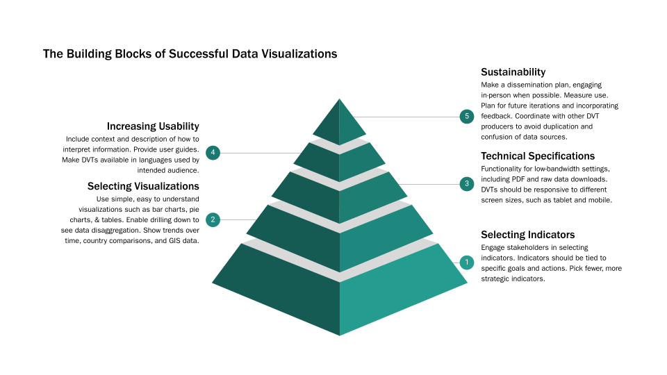
The principle recommendations from this work can be categorized into five main divisions. As seen in the graphic above, these divisions can be imagined as the building blocks that comprise DVT development. A theme that runs through each of these categories is understanding the audience. What kinds of actions and decisions are they expected to make based on the information presented in the DVT? Knowing the audience will determine the language(s) the DVT should be in, the types of data needed, how to best visualize the data, and the functionality needed for the platform overall.
1. Selecting Indicators
Careful selection of indicators was highlighted in both the UNICEF and IAP consultations. Indicators should be selected in conjunction with the communities the DVT aims to support, and developed to match the needs of the intended audience. Where possible, DVTs indicators should be developed based on existing data sources. Sometimes less is more. If the number of visualized indicators is large, users may not be able to determine the key messages and areas where action is most needed. Picking fewer, more strategic indicators is recommended.
2. Selecting Visualizations
In general, visualizations should be simple, easy to understand, and allow for different levels of granularity through data desegregations. Considering the audience is critical for knowing what visualizations to include:
-
- Policymakers – visualizations that are easily and quickly understood like simple bar charts, and visualizations that show comparisons or trends over time;
- Program Officers at the Ministry of Health or regional levels – visualizations can be more detailed, these DVT users are more experienced with traditional charts and graphs like line graphs and pie charts;
- Community Members/Advocates – visualizations like infographics or that have more narrative features work best.
3. Technical Specifications
When developing a DVT, certain technical aspects should be considered. Some of the important features highlighted in the interviews were the need to develop DVTs with low-bandwidth options. While some dashboards we reviewed took less than a second to load, others took over five seconds, which would be even slower in low-bandwidth settings. Including downloads of raw data into CSV and downloading chart images as PDFs and other print-ready formats means the data can be accessed when the internet is not available. We also found that many DVT users access the internet via mobile devices, meaning DVTs must be responsive to different screen sizes.
4. Increasing Usability
Data visualizations should be accompanied by contextual information on how to interpret the information being displayed. User guides can also help ensure that DVTs are used and understood correctly. Importantly, DVTs should be available in languages relevant for the desired audience. These considerations can help reduce the barriers for using DVTs.
5. Sustainability
Elements that secure success of DVTs long-term include planning for dissemination of the DVT, beyond just publishing it. Interviewees spoke of the importance of meeting face-to-face with expected users for dissemination. Along with dissemination, measuring use is also critical. DVT producers should consider what forms of measurement are possible. Producers could track site views, data downloads, and other measurements of engagement, as well as tracking when systems are cited in publications. Creators of DVTs should also plan for the future. It’s typical for DVTs to need to be updated based on changing contexts, changes in the evidence base, or feedback received. Expecting and planning for changes from the beginning can ensure the long-term sustainability of the visualizations and the platform on which they are housed.
DVTs in Times of Crisis
In the event of a crisis, such as COVID-19, certain factors should be considered. It is important to identify what is “good enough” since crises do not typically allow time to achieve perfection in a DVT tool. Using already available data will also speed up DVT development. However, it is important to consider what data gaps exist and how that is going to impact decision-making. For example, COVID-19 data disaggregated by age and gender has been a problematic data gap. Identification of data gaps can also raise visibility on where additional data collection should be prioritized. Ultimately every acute crisis will come to an end. Consider how the DVT can be repurposed once the crisis is over.
Creating a Checklist
A checklist of key considerations can be helpful for creators of DVTs to ensure new tools meet their audience’s needs, are easy to understand, and are likely to succeed long-term. An example of what might be included in a checklist can be found below.
| Component | Considerations |
| Audience |
|
| Indicators |
|
| Visualizations |
|
| User Needs |
|
| Sustainability |
|
| In an Emergency |
|
Over the next few weeks, we will explore other aspects of developing data visualization tools, including how we put these principles into practice.
Cover Image: Screenshot of the Countdown to 2030 Dashboard
Share
Related Posts
Reflecting on 3 Years of Digital Advisory Support for Agricultural Transformation
As the DAS program concludes, this blog reflects on its impact in advancing digital transformation in agriculture, highlighting lessons on capacity building, knowledge transfer, and sustaining resilient food systems.

The Data Crisis Following USAID’s Withdrawal: Opportunities to Reimagine Data Systems
For decades, USAID and other US government funding supported global data systems, from health surveys and early warning tools to digital infrastructure for ministries. The abrupt termination of USAID funding has triggered twin crises: a halt to data collection and the undermining of digital systems – reveal existing inefficiencies and instabilities in how data is collected, managed, and shared both within and between countries.
Launching a Partnership Matching Service for Nonprofits
While a lot of us have talked about the potential, value, and – in some cases – need for more mergers and acquisitions in the non-profit space, recent events have made it clear: now is the time. That’s why the teams at Accountability Lab, Development Gateway: An IREX Venture and Digital Public, partnered up to develop both a new toolkit, a partnership matching service, and professional support infrastructure aimed at assisting the organizations facing this challenge.