The Devel(opment) is in the Details: A Detailed Look into our Metrics
In Parts 1 and 2 of this series, we explored how the robust, timely, and valid collection of output data enhances transparency and collaboration, leads to better outcomes, and can even support claims of causality. In this last part of the series, we invite the reader to take a deeper dive with us into our scorecard methodology. Throughout this discussion, we’ll be using the actual data we collected throughout our review of donor websites and their project documentation. Please note that although we will discuss ways in which donors struggle to meet the ideal standards outlined in parts 1 and 2, our intention throughout the entire process was not to name and shame; rather, we do this to highlight opportunities for learning and growth and to help organizations identify concrete steps they can take to improve operations and bring about better development results.
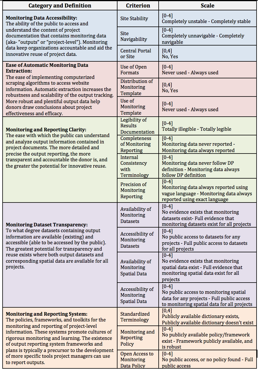
Operationalization
Having settled on our scoring criteria (outlined in Part 2), we moved on to operationalizing a way to generate a score for each element in the most objective and transparent manner possible. Maintaining scoring consistency as we evaluated 16 radically different M&E systems was a critical concern. Scales, for example, were built to minimize subjectivity through the following considerations:
- Using quantitative measures like percentages and counts whenever possible
- Focusing more on the existence of tools and policies rather than their quality
- Avoiding ambiguous measures like “high/low,” or “good/bad”
- Avoiding normative statements and value judgments, such as “donors should” or “the most important”
- Constructing a terminology reference for commonly used phrases such as “outcome,” “output,” “geospatial,” and “open.”
With these considerations in mind the following table presents the categories and criterion of the Scorecard along with relevant definitions, scales, and data classification types.
Table 1: Score categories, criterion, and beyond
As evidenced by the table, each criterion was given a score based on a 0-4 scale or a binary indicator (0,1). Each criterion also had its own scoring protocol. The protocol for scoring Site Navigability, for example, was outlined thusly:
“Note any difficulties you [the scorer] encountered throughout your search in searching for and retrieving project documentation like browser incompatibility with site features, nondescriptive subpage or section titles, databases with limited search or filter functionality, noncentralization of documentation, or link loops. If no navigability issues exist, give a score of 4. If some navigability issues exist, give a score of 0-3, depending on how frequent and severe the interruptions are/ were.”
Use of Open Formats is another good example:
“Note how frequently project documentation is offered in open formats such as TXT, DOCX, ODT, CSV, ODP, JPEG, PNG, SVG, GIF, JSON, or XML in place of closed formats such as PDF, DOC, XLS, PPT, or PSD. If a donor offers the same documents in both open and closed formats, consider them as offering that document in open format. If the donor never uses open formats, give a score of 0. If the donor always uses open formats, give a score of 4. If the donor offers a mix of open and closed project documentation, give a score of 1-3, depending on the percent of total project documents that are open in nature.”
Each organization was held to these scoring protocols in turn. Consider, for example, the explanation for DFID’s receiving a “3” out of “4” for Site Navigability:
“The central DFID site does not operate on a standalone basis, but rather as a subsection of the general UK.gov site. This can lead to some confusion when using the site to search for DFID-specific information, as the search bar returns results from the entire UK.gov site, and not just the DFID section. Searching for project reporting guidelines, for example, returned hundreds of irrelevant results from non-DFID subsections. Further, the “Publications” page only allows for limited filter options. Project documentation is relatively easy to search through the Development Tracker portal, though this portal lacks year filter functionality. While the DFID website is largely clean and its subsections well labeled, there is room for improvement of the search and filter functionalities.”
Each organization was subject to fair, but meticulous scrutiny in order to identify clear areas of best practice and site or policy features in need of improvement. The idea again being to inspire collaboration between Development Gateway and these organization as opposed to shaming the organizations or comparing them to some unrealistic ideal.
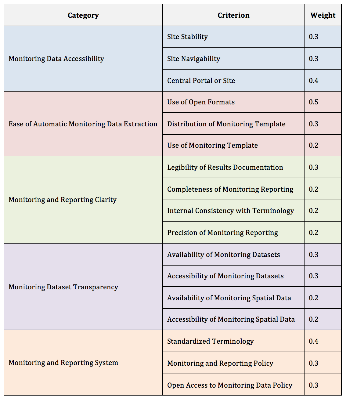
Weighing In: End User Purpose Informs our Weights
With our literature-informed operationalization constructed, we then settled on a weighting methodology for each of our 5 categories. In choosing our weights, we kept the end user in mind at all times. A key tenant of the Data Revolution is that development professionals must ask of themselves “data for what, data for whom?” At DG, we believe that data collection efforts must center on the needs of the users.
Understanding how data will be used and by whom can help ensure data efforts are targeted and efficient. Similarly, in assigning weights, we wanted to ensure that the elements of the monitoring systems that will most affect the end user held the most weight in the final DP score. For this reason, the weight assigned to each criterion is anchored to how essential that element is to the experience of the end user; in the “Ease of Automatic Monitoring Data Extraction” category, for example, donor use of open formats is more essential for the end user to make use of data than is the use of a standardized monitoring template, so it receives a higher weight.
Table 2: Weight for it — Prioritizing End User Experience
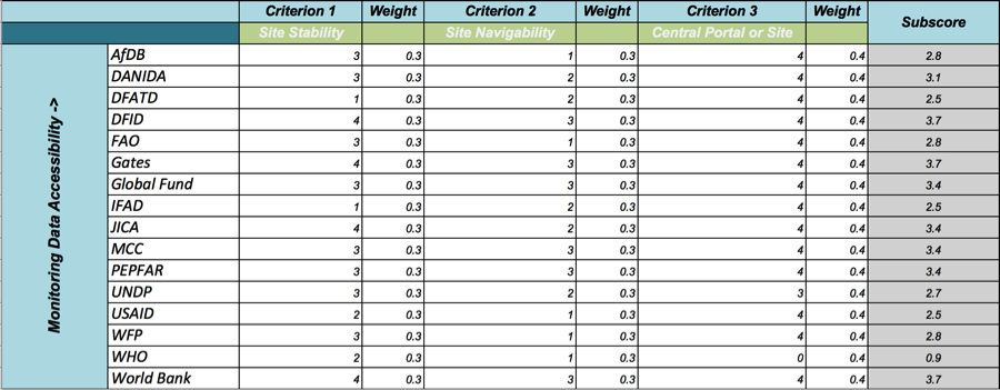
The (Final) Product of Our Environment
With all indicators scored for all development partners, weighted category subscores calculated, and a final average of subscores run to generate a final score, our initial scorecard work was finally complete. Below is a visual overview of the scoring process—a snippet from the final cross-partner scorecard set, with scores from the “Monitoring Data Accessibility” category.
Table 3: Picture perfect — A completed scorecard subsections
(Data) Framing the Conversation with Development Partners
With the scoring behind us, our priority now is to consult with development partners to discuss the results of the Scorecard in order to hear directly about the challenges to data access and use they have encountered. The aim is to find ways to make project data available, open, and actionable. After all, if the data are not useful, why collect them in the first place?
Framing our conversations around the practical implications of improving results tracking and reporting systems will highlight the pragmatic importance of the RDI project as a whole. We have seen in initial consultations that the more eye-catching hook of the Scorecard can be the ability to “rank” organizations based on their composite score. However, we want to be clear that our interest in quantifying performance indicators does not come from a desire to compare overall humanitarian performance. Rather, we developed this detailed numerical methodology to ensure we exercised internal consistency in exploring the many valid responses to the same set of common challenges to results data reporting.
In line with this, we have no interest in a cross-organizational analysis other than to highlight extremely promising practices. We are most interested in exploring how each organization itself can leverage its existing tools and resources to tackle challenges to results reporting to meet their internally-defined goals. To this end we encourage organizations to review their overall score as shown on the RDI Visualization website (the final component at the bottom of the page), to solicit a more-detailed report from DG’s Data Science Department, and to set up a meeting or series of meetings to discuss the individual metrics and any collaboration that could pave the way forward for results data gathering, organizing, publishing, and analyzing.
Share This Post
Related from our library

Harnessing the Power of Data: Tackling Tobacco Industry Influence in Africa
Reliable, accessible data is essential for effective tobacco control, enabling policymakers to implement stronger, evidence-based responses to evolving industry tactics and public health challenges. This blog explores how Tobacco Industry strategies hinder effective Tobacco control in Africa, and highlights how stakeholders are harnessing TCDI Data to counter industry interference.

Building a Sustainable Cashew Sector in West Africa Through Data and Collaboration
Cashew-IN project came to an end in August 2024 after four years of working with government agencies, producers, traders, processors, and development partners in the five implementing countries to co-create an online tool aimed to inform, support, promote, and strengthen Africa’s cashew industry. This blog outlines some of the key project highlights, including some of the challenges we faced, lessons learned, success stories, and identified opportunities for a more competitive cashew sector in West Africa.
Digital Transformation for Public Value: Development Gateway’s Insights from Agriculture & Open Contracting
In today’s fast-evolving world, governments and public organizations are under more pressure than ever before to deliver efficient, transparent services that align with public expectations. In this blog, we delve into the key concepts behind digital transformation and how it can enhance public value by promoting transparency, informing policy, and supporting evidence-based decision-making.