The Good, the Bad, and the Ugly of Using IATI Results Data
It didn’t surprise me when I learned that — when Ministry of Finance officials conduct trainings on the Aid Management Platform for Village Chiefs, CSOs and citizens throughout the districts of Malawi — officials are almost immediately asked:
“What were the results of these projects? What were the outcomes?”
We’ve heard the same question echoed by a number of agriculture practitioners interviewed as part of the Initiative for Open Ag Funding. When asked what information they need to make better decisions about where and how to implement their own projects, many replied:
“We want to know — if [others] were successful — what did they do? If they weren’t successful, what shouldn’t we do?”
At MERL Tech DC earlier this month, we decided to explore the International Aid Transparency Initiative (IATI) format, currently being used by organizations and governments globally for publishing aid and results data. For this hands-on exercise, we printed different types of projects from the D-Portal website, including any evaluation documents included in the publication. We then asked participants to answer the following questions about each project:
- What were the successes of the project?
- What could be replicated?
- What are the pitfalls to be avoided?
- Where did it fail?
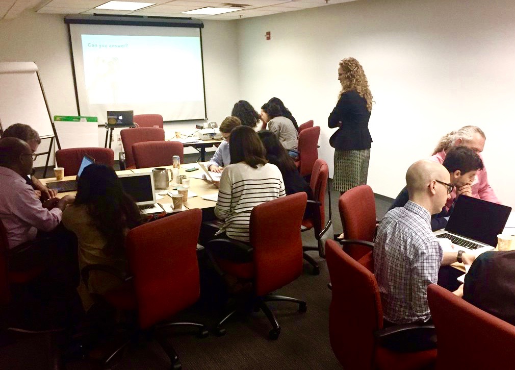
Taryn Davis leading participants through using IATI results data at MERLTech DC
We then discussed whether participants were (or were not) able to answer these questions with the data provided. Here is the Good, the Bad, and the Ugly of what participants shared:
The Good
- Many were impressed that this data — particularly the evaluation documents — were even shared and made public, not hidden behind closed doors.
- For those analyzing evaluation documents, the narrative was helpful for answering our four questions, versus having just the indicators without any context.
- One attendee noted that this data would be helpful in planning project designs for business development purposes.
The Bad
- There were challenges with data quality — for example, some data were missing units, making it difficult to identify — was the number “50” a percent, a dollar amount, or another unit?
- Some found the organizations’ evaluation formats easier to understand than what was displayed on D-portal. Others were given evaluations with a more complex format, making it difficult to identify key takeaways. Overall, readability varied, and format matters. Sometimes less columns is more ( readable). There is a fine line between not enough information (missing units), and a fire hose of information (gigantic documents).
- Since the attachments included more content in narrative format, they were more helpful in answering our four questions than just the indicators that were entered in the IATI standard.
- There were no visualizations for a quick takeaway on project success. A visual aid would help understand “successes” and “failures” quicker without having spend as much time digging and comparing, and could then spend more time looking at specific cases and focusing on the narrative.
- Some data was missing time periods, making it hard to know how relevant it would be for those interested in using the data.
- Data was often disorganized, and included spelling mistakes.
The Ugly
- Reading data “felt like reading the SAT”: challenging to comprehend.
- The data and documents weren’t typically forthcoming about challenges and lessons learned.
- Participants weren’t able to discern any real, tangible learning that could be practically applied to other projects.
Fortunately, the “Bad” elements can be relatively easily addressed. We’ve spent time reviewing results data for organizations published in IATI, providing feedback to improve data quality, and to make the data cleaner and easier to understand.
However, the “ugly” elements are really key for organizations that want to share their results data. To move beyond a “transparency gold star,” and achieve shared learning and better development, organizations need to ask themselves:
“Are we publishing the right information, and are we publishing it in a usable format?”
As we noted earlier, it’s not just the indicators that data users are interested in, but how projects achieved (or didn’t achieve) those targets. Users want to engage in the “L” in Monitoring, Evaluation, and Learning (MERL). For organizations, this might be as simple as reporting “Citizens weren’t interested in adding quinoa to their diet so they didn’t sell as much as expected,” or “The Village Chief was well respected and supported the project, which really helped citizens gain trust and attend our trainings.”
This learning is important both for organizations internally, enabling them to understand and learn from the data; it’s also important for the wider development community. In hindsight, what do you wish you had known about implementing an irrigation project in rural Tanzania before you started? That’s what we should be sharing.
In order to do this, we must update our data publishing formats (and mindsets) so that we can answer questions like, “How did this project succeed? What can be replicated? What are the pitfalls to avoid? Where did it fail?” Answering these kinds of questions — and enabling actual learning — should be a key goal for all project and programs; and it should not feel like an SAT exam every time we do so.
Image Credit: Reid Porter, InterAction
Share This Post
Related from our library

Harnessing the Power of Data: Tackling Tobacco Industry Influence in Africa
Reliable, accessible data is essential for effective tobacco control, enabling policymakers to implement stronger, evidence-based responses to evolving industry tactics and public health challenges. This blog explores how Tobacco Industry strategies hinder effective Tobacco control in Africa, and highlights how stakeholders are harnessing TCDI Data to counter industry interference.

Building a Sustainable Cashew Sector in West Africa Through Data and Collaboration
Cashew-IN project came to an end in August 2024 after four years of working with government agencies, producers, traders, processors, and development partners in the five implementing countries to co-create an online tool aimed to inform, support, promote, and strengthen Africa’s cashew industry. This blog outlines some of the key project highlights, including some of the challenges we faced, lessons learned, success stories, and identified opportunities for a more competitive cashew sector in West Africa.
Digital Transformation for Public Value: Development Gateway’s Insights from Agriculture & Open Contracting
In today’s fast-evolving world, governments and public organizations are under more pressure than ever before to deliver efficient, transparent services that align with public expectations. In this blog, we delve into the key concepts behind digital transformation and how it can enhance public value by promoting transparency, informing policy, and supporting evidence-based decision-making.