The tangled web we weave: Mapping donor outcome indicators
Indicator data (what we’ve referred to as “outcome indicators” as part of the Results Data Initiative, or RDI) allow for development actors to understand the context, trends, and impacts of development programs. Like any data, the usefulness of an indicator is directly dependent on its quality – timeliness, representativeness, and accuracy. But unlike other types of data, indicators live in a chain of data enumerators, hosts, and users – meaning a lot of effort from a lot of different people goes into collecting, compiling, and using each one.
For example, let’s say I work at the Global Fund as a project manager, and need an indicator for the results framework for a new project focusing on dispersing anti-malarial bed nets in Ghana. I decide to select as an indicator “Use of Insecticide Treated Nets (ITN) for Children under 5.” This indicator is hosted and published by UNICEF, and the data comes from household surveys – either a Demographic and Health Surveys (DHS) or Malaria Indicator Survey (MIS). After I add this indicator into our project plan, my colleagues use it to decide where we should implement new project activities, including the distribution of bed nets to reduce malaria transmission. This process is visualized in the diagram below, where each box often represents a different development partner.
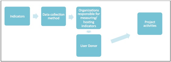
Diagram of indicator collection, hosting, and use
While the above seems like a fairly straightforward collection-to-use case, the sheer volume of indicator data turns a single indicator use chain into a tangled ecosystem. In our RDI work alone (limited to three countries, two sectors, and 17 development partners), we identified 750 different agency-level outcome indicators!
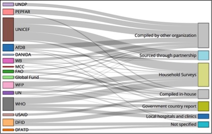
Original sources of donor health indicators – view full visualization
Why does that number matter? Like we’ve argued before, immense amounts of data collection often has a human cost – particularly on time and finances better spent delivering services to those in need. But even from a strictly data-driven perspective, what stands out most is how duplicative many of these indicators are. It’s not that we, as a development community, are collecting 750 different data points; in many cases, we’re asking the same questions in ever-so-slightly different ways, begging the question of efficiency in data collection and maintenance.
For example, in health, an FAO indicator measures “number of people who are undernourished,” while UNICEF measures the “prevalence of children receiving a minimum acceptable diet”. Further confounding matters, FAO and UNICEF cite different sources for these indicators. FAO data comes from both national household surveys and government country reports, while UNICEF uses DHS and MICS surveys. Additionally, these indicators are two sides of the same coin – one measures “undernourishment” while the other measures “minimum acceptable nourishment.” The dis-aggregations are also different – children vs. total population. Because of this, 74 countries have only undernourishment data, 6 have only minimum acceptable nourishment data, and 42 have both.
While this difference in indicator phrasing is understandable, in an ideal world, we could have one “malnutrition” indicator, with the ability to disaggregate based on age or other important subgroups. If development partners were to coalesce around fewer, more robust indicators, we could likely devote more resources to further improve their quality.
For example, timeliness – key for efficiently targeted interventions – is a crucial challenge in today’s indicator ecosystem. Much indicator data relies on DHS/MICS surveys, usually (though not always) conducted every 5 years, or government censuses or reports – conducted more than 10 years ago in some countries, often depending on budgetary considerations. We would likely see gains in data quality if we re-oriented ourselves away from collecting a range of similar indicators, toward collecting a targeted series of indicators more frequently.
To conclude, our team undertook this indicator source and flow-mapping exercise with the goal of gaining a clearer picture of where outcome indicators come from and how they might be improved. We found a complex network of indicator sources, methodologies, host organizations, and data users – bringing all the implied data quality, efficiency, and resource questions with it. We hope that our findings help development partners reduce data gathering inefficiencies through more widespread collaboration in investing in original data collection sources, particularly national governments and other surveying organizations. For us, the next steps will be tracking the efforts of these original data source organizations to harmonize outcome indicators between their own censuses and reports, and development partner priority lists. This will allow us to make clear recommendations as to where targeted donor investments could reduce indicator duplication and confusion and improve overall indicator quality.
Share This Post
Related from our library

Harnessing the Power of Data: Tackling Tobacco Industry Influence in Africa
Reliable, accessible data is essential for effective tobacco control, enabling policymakers to implement stronger, evidence-based responses to evolving industry tactics and public health challenges. This blog explores how Tobacco Industry strategies hinder effective Tobacco control in Africa, and highlights how stakeholders are harnessing TCDI Data to counter industry interference.

Building a Sustainable Cashew Sector in West Africa Through Data and Collaboration
Cashew-IN project came to an end in August 2024 after four years of working with government agencies, producers, traders, processors, and development partners in the five implementing countries to co-create an online tool aimed to inform, support, promote, and strengthen Africa’s cashew industry. This blog outlines some of the key project highlights, including some of the challenges we faced, lessons learned, success stories, and identified opportunities for a more competitive cashew sector in West Africa.

Digital Transformation for Public Value: Development Gateway’s Insights from Agriculture & Open Contracting
In today’s fast-evolving world, governments and public organizations are under more pressure than ever before to deliver efficient, transparent services that align with public expectations. In this blog, we delve into the key concepts behind digital transformation and how it can enhance public value by promoting transparency, informing policy, and supporting evidence-based decision-making.