What’s Your Story and How Can Data Help Tell It?
For as long as Development Gateway has specialized in data, we have also specialized in data visualizations. In that time, we have discovered the pitfalls and learned ways that data visualizations can increase data use. In this post, we look specifically at selecting the right type of visualization for the story you want to tell.
Types of Stories
Your data can tell many different stories. For each visualization consider which story is most important. This will help you understand how best to visualize the information. Are you:
- Comparing quantities – Showing at least two variables at once
- Comparing trends – looking at changes over time
- Showing Relationships – display a connection or correlation between at least two variables
- Exploring composition – reviewing parts of a whole
- Showing distribution – looking at how your data are spread out
Story 1: Comparing Quantities
Using an Informational Table is great for when absolute values of your data are important, although you may have to do some manual calculations in order to understand the story the data are telling. Adding color scales (e.g., green for increases, red for decreases) or symbols (up/down arrows) to your table can make your story more intuitive.

Pros:
- Allows you to view all the details of your data
- Allows you to look at qualitative variables in addition to quantitative
Cons:
- The data story is not as immediately intuitive. It is not as easy to see patterns, relationships, and trends. For example, how quickly can you decipher whether the total cases of diseases of children under five have declined from 2015 to 2016?
- If there are too many data points, the core of the story is hard to get to
Bar Chart: Categories (Vertical & Horizontal)
Bars charts are one of the most intuitive ways to visualize quantities across multiple categories. Rectangles or “bars” can be plotted vertically or horizontally, with the heights/lengths of each bar proportional to the values that they represent. Because proportionality is so important for understanding bar graphs, the y-axis for bar charts should always start at zero. Plotting your bar chart horizontally can keep your axes clean and tidy if your data labels are very long.
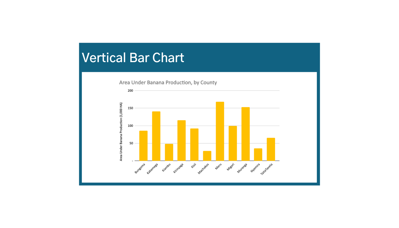

Pros:
- One of the most intuitive and easily understood data visualizations to display differences in relative quantities. Ask yourself, “why not a bar chart?”
- Can be easily adapted to include multiple variables or groupings
Cons:
- When you have multiple variables or categories (i.e., grouped bar charts), meaning can get lost
- When you have a wide range of data values or a large scale, differences in quantities are harder to see
- Bar charts are usually interpreted as a “snapshot” of a singular moment in time. Be careful not to display change over time with bar graphs – use a line instead to show trends!
Waterfall Chart: Cumulative Net Value vs. Compounding Values
The waterfall chart is used to portray how an initial value is affected by a series of intermediate positive or negative values. A Cumulative Net Value Waterfall Chart is great when you know that your data has both positive and negative values, and you are interested in displaying the cumulative effect. Waterfall Charts can also display values that compound over time. Meaning when consecutive values start at previous values instead of at zero. Values in waterfall charts can either be time-based (see the first image below),1 or category-based (see the second image below).2


Examples of data that are good for waterfall charts:
- Budget tracking
- Inventories
- Profits
- Cash flows
- Consumption
Finally, you can also use waterfall charts to show deviation from a set value over time by displaying the bars as above or below that set value. This is sometimes also referred to as a diverging bar chart. With this chart, the emphasis is on the relative change rather than absolute values.

Pros:
- Allows you to demonstrate the cumulative effect and or positive and negative values at the same time
- You can accurately visualize when your starting values are not zero, which allows you to demonstrate progress against a certain starting point.
Cons:
- Sometimes not as intuitive, which makes them less usable for wide audiences.
- Not very precise. This type of visualization works best when relative increases and decreases are enough to tell your story.
Bubble Charts: Three Variables
Bubble charts are useful when relative size or quantity is an important factor in one of your variables. For example, the larger the country’s population, the more people are employed in agriculture. Thus, the relative size of the bubbles is an important piece of this story. In this example, on an interactive map, hovering over a circle displays the three variables for South Africa: employment, agri-land, and population. The visualization shows the relationship or testing correlation among three variables.3

Story 2: Comparing Trends
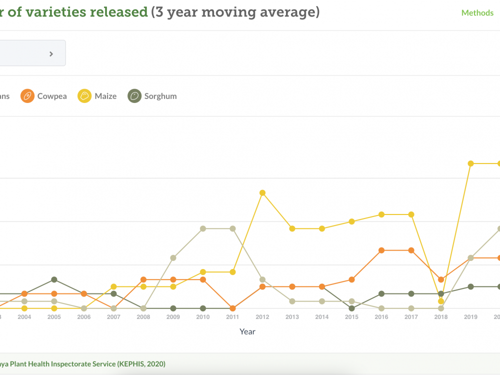
Line Chart: Time Series, Multiple Variables, Descriptive Statistics
Using Time Series Line Charts you can connect discrete but continuous data points with line segments to show general change over time. This works well because lines are visually intuitive. In line charts that display change over time, units of time should always be represented on the x-axis.

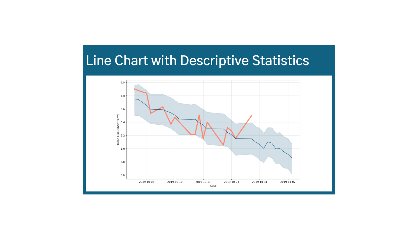
Line charts are also great because you can plot values for multiple variables at once, but be careful, your story will be lost if:
- You have too many lines
- The user needs to refer to the key too often
- The scale is too big or small
- There is no real trend over time
Include descriptive statistics to communicate your story in more detail. For example, the second chart above displays actual values in orange, forecasted or predicted values in blue, and the standard deviation in the gray shaded area.4 If your line chart isn’t conveying a story clearly, consider adding the following details to your visualization:
- Averages
- Regression lines
- Estimated values
- Min/max values
- Upper/ lower quartiles
- Baselines/ targets
- Totals
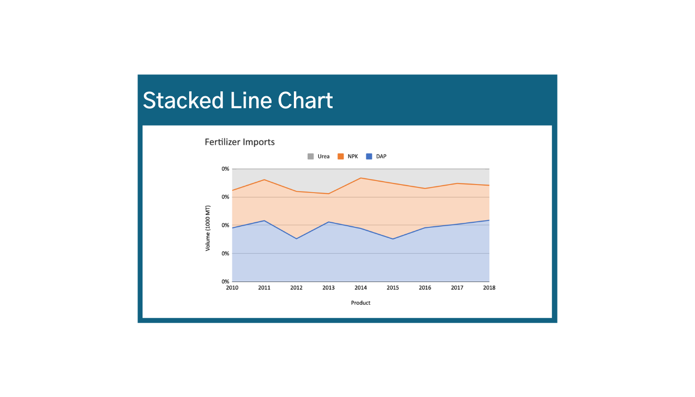
Circular Area Chart: Cycles
If your story involves cycles, circular area charts are a great way to visualize processes over time and/or as part of a cycle, for example, when you anticipate seasonal changes. These charts are also commonly called radar charts or spider charts for the spiderweb or radar shapes that they produce.

With this type of visualization, you can clearly see how often the data values are zero. In the example, you can clearly see that imports of specific types of fertilizer (DAP) vary drastically at different times in the year. However, this type of chart is only useful when only relative differences in values are important because it is harder for the reader to interpret absolute values.
Story 3: Showing Relationships
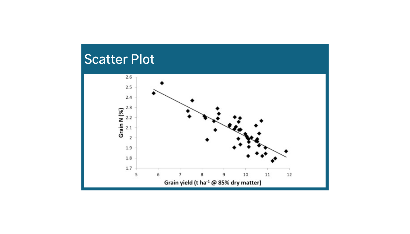
Scatter Plot: Two Variables
A simple plotting of individual values along the X and Y axes can be useful when you want to view the relationship between two variables, but you are not sure what that relationship looks like. In this example, we are looking at the relationship between the percentage of Nitrogen in the grain and the yield.5 The line represents a regression – a kind of “linear average” that is calculated using the minimum shortest distance between the and the line real data (ordinary least squares method). This can be calculated using statistical software.


Scatter plots can also show you when there is no relationship or correlation between your variables at all. In this example, there is no clear relationship between variable x and variable y. An example of this is the second chart above.6
If precision or absolute values are less important, and you would rather generalize or summarize your data, you can calculate some transformations to review trends more generally. An example of this is shown in the third chart above.7 This is also a great strategy for removing unnecessary clutter!
Types of transformative calculations:
- Normalization
- Regression lines
- Combining multiple variables at once (ex: averaging consumption across multiple districts)
Story 4: Exploring Composition
Pie Chart: Composition
A Pie Chart is a type of graph in which a circle is divided into sectors that each represent a part of a whole. It is great for when your story is focused more on relative proportions than precise quantities, or when approximate values are acceptable. If you need precise quantities, a bar or line chart might be a better option. This type of visualization is most useful when you’re just looking for one or two major players (for example, a pie chart that shows browsers: Chrome, Internet Explorer, and Firefox) in relation to one another. Be careful that there are not too many components and that there is some variance in proportions. Otherwise, comparisons and labels are harder to make and interpret. For example, without looking at the numbers or percentages, can you immediately tell whether there was more NP or MOP imported?
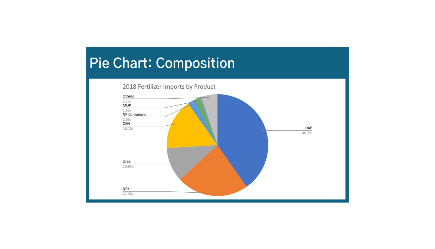
Pros:
- Allows you to quickly visualize components with respect to a given total
- Shows relative proportions of those components
Cons:
- Not as precise for comparing absolute values
- Humans have a hard time interpreting differences in sizes of circles or arcs (see: Jastrow illusion)
- It is a snapshot in time
- Circles can take up a lot of space!
Semi-Circles: Progress
Half circle charts are a good way to visualize progress towards a target or goal, like key performance indicators. One note, the graph below could be improved by adding quantity labels. For example – if mango production is at 90%, roughly how many more mangos need to be produced in order to meet the target?8

Story 5: Showing Distribution
Showing distribution is about explaining how variables are spread out. For example in maps we see distribution across locations; histograms show the distribution of frequencies or counts, continuous data, and ranges; box plots show distribution and variance together.
Choropleth Maps: Distribution
Choropleth Maps provide an easy way to visualize data variances across geographic units for example by country, state, region, divisions, or counties.9 In choropleth maps, the colors displayed are proportional with values. These types of visualizations are good when geography is central to your story, such as informing decisions on:
- Resource allocation
- Targeting
- Needs-based programming

Pros:
- Allows visualization on information trends by location, usually by geographic unit
- Color scales allow you to categorize, organize, and visualize your data into ranges
- Great for when your data is not precisely geolocated – i.e., you only have states, regions, counties, etc.
Cons:
- Location disaggregation limited by the geographic admin unit selected (i.e., you cannot visualize variances within the administrative unit)
- You can only show one variable at a time, unless you add symbols
- Requires a geolocation (admin unit) for each unit of data
- If your audience is not as familiar with the geography of this particular place, the meaning can get lost
- Consider pitfalls like whether your map is emphasizing raw values when per capita would be more appropriate; be aware when your data is really just showing population density and not concentrations of trends
Maps can be created with software like ArcGIS, Google Maps. Analytical software can also help calculate things like minimum distance between two points of interest.
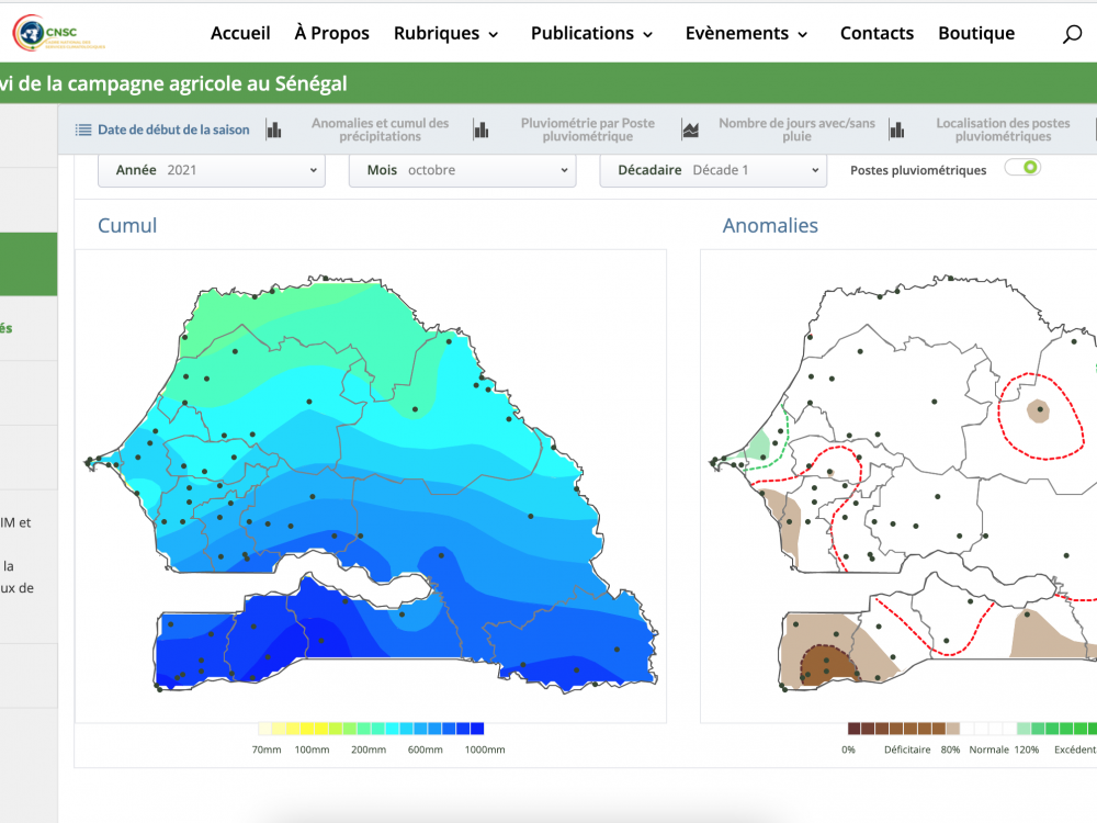
Heat Maps: Concentrations
A heat map, also known as an isopleth map, is a graphical representation of data where data are mapped to their precise location and represented as a range of colors. Heat maps allow you to visualize frequencies and concentrations across administrative units. It is useful when you anticipate differences across geographic areas (e.g., urban vs. rural settings) usually related to population concentrations.10

Pros:
- Allows you to view frequencies/concentrations and distributions of data where it actually occurs
- Not limited to administrative unit
Cons:
- Can only show one variable at a time
- Requires precise geolocation (coordinates)
- Some other geographic details may get lost – e.g., bodies of water, cities, borders
- If your audience is not as familiar with the geography of this particular place, the meaning can get lost
- Consider pitfalls like whether your map is emphasizing raw values when per capita would be more appropriate; be aware when your data is really just showing population density and not concentrations of trends
Key difference between heat maps and choropleth maps is that the visualization of your data is not limited to the administrative unit. But choropleth maps are only useful if distribution or concentration is important – you need some significant variances in your data (such as population concentration) across locations in order for the story to emerge (otherwise it is all strange colors).
Histograms: Frequencies
Histograms allow you to view frequencies, or the distribution of your data, by grouping data into ranges or intervals. Histograms are good for when you’re observing frequencies across a known or continuous distribution of intervals, like age, test scores, or probability. They are also great for displaying data that usually follow a “bell curve” distribution by showing the precise value within the range indicated by the x-axis.


Usually with histograms, the values along the x-axis are usually the intervals/ranges across a known distribution, and the y-axis is the frequency (or the number of times data values occur within the given range). For example, it’s clear that the majority of farmers reported a 100-300% increase in yield after the intervention. As with bar graphs, the y-axis should always start at zero for all histograms.
At first glance, this may look like a bar graph. The key difference between histograms and bar graphs is that you cannot reorder the x or y-axis without losing meaning.
For example – how could you rearrange the ranges on the x-axis? (hint: you can’t – it wouldn’t make sense)
Pros:
- Good for visualizing whether your data are skewed in one direction or another
- Understand where values fall along a series of ranges
Cons:
- Sometimes, vertical axis as frequencies is not as intuitive
- Generalizes your data according to ranges
- Only works when frequencies or distribution are important
In the first example – it’s pretty clear that most farmers reported a positive increase in yield – which is pretty good! However, a significant number of farmers reported a decrease in yield – i.e., the results are not as positively skewed as we would hope.
Double Histograms and/or violin plots can also be useful for displaying multiple distributions at once, such as population age distribution by gender.11
Box Plots: Variance
Great for when you want to display range and variance across categories. The “box” in box plots captures where 75% of your data values fall, while the lines coming out of the box show the range of outliers in the remaining 25% of your values. For example, fertilizer type B recorded the highest instance of growth, but also has a very wide range of effects on growth overall.12 In fact, sometimes growth was less compared to the control group.


This chart also shows that you can bet on more predictable increases in yield values with fertilizer types A and C than you might with B.
Box plots are created by plotting values of descriptive Statistics (aka “central tendencies”):
- The line starts at the minimum value
- The top line of the box represents the first/upper quartile = halfway between median and minimum
- The line in the middle of the box represents the median = the “middle value” of your data (if you laid out your data across a number line)
- The bottom line of the box represents the third/lower quartile = halfway between median and maximum
- The line ends at the maximum value
Pros:
- Clearly displays descriptive statistics that summarize how your data varies across categories – median, upper quartile, lower quartile, and outliers
- “Box” clearly shows the range of values where 75% of your data fall
Cons:
- It is not the most intuitive visualization, especially for audiences that are unfamiliar with descriptive statistics
- Requires calculation of mean, Q1, and Q3
Combining Stories: Trends + Compositions
There are several ways to combine stories, such as displaying trends and compositions together. A prerequisite for this combination is data sets with values associated to different moments in time (it can be daily, monthly, quarterly, annually.)
Stacked Bar Chart: Trends + Composition
A Stacked Bar Chart uses bars to show comparisons between category totals (monthly imports) and subcategories (fertilizer type) that make up those totals. The overall height of each bar represents the total for that month, reflected in their height on the y-axis. The benefit of this type of visualization is showing multiple part-to-whole relationships. A few caveats: be careful as a Stacked Bar Chart won’t work if you are not displaying parts of a whole. Additionally, consider color and consistency. The color order of the categories as they are stacked on the bar should always the same, in the example blue – orange – grey – yellow. This consistency helps viewers interpret when certain color values are zero, and so they do not have to visually search for the variable of interest. Here, it is clear that there were no diammonium phosphate imports from July to September.
Pros:
- Stacked charts are great for showing category subtotals (monthly imports) and how subcategories (fertilizer type) contribute to those totals
- Multiple part-to-whole relationships over time or across multiple categories (x-axis)
Cons:
- These visualization types can easily be misinterpreted
- Precise quantities are less clear
- Requires careful labeling and color schemes to be intuitive


Like traditional Bar Charts, Stacked Bar Charts can be flipped horizontally (see example two above). This is a great strategy when space or size is a concern – like if your data requires a long x-axis to clearly display the information. In this example, The x-axis has been scaled to display 100 MT (instead of 1MT). This allows your data to “stretch out” a bit so the comparison is easier to read.
Stacked Bar Chart: Percent + Composition
You can also stack proportions/compositions to display parts of a whole, like in the third example. This works well when relative proportions are more important than absolute values. For example, can you easily tell from this graph how many MT of NPK were imported in August? Not really, you only know that it was a vast majority of all imports for the month of August were NPK. Can you tell from this graph which month imported the most fertilizer? Not at all.
Area Charts (stacked line chart): Trends + Composition
Area Charts are similar to stacked bar charts, but using lines. This type of visualization is great for observing trends, and the components of those trends. The same rules apply for interpreting quantities. Be careful how you format your data though, you don’t want lines crossing each other!

Area Charts can be used to tell a story that combines percentage, composition, and trends. This is helpful in visualizing proportions over time. Again, this works well when relative proportions are more important than relative quantities. One caveat is that this really only works if one variable is consistently greater than others (otherwise you get lines crossing themselves) and when values between variables are large enough to review the difference between them (otherwise there will not be any space between the lines.)
Pros:
- Good for showing part-to-whole relationships over time
- Can show percentages as well as quantities
- Shows groups within sub-groups
Cons:
- Be mindful that you’re actually displaying compounding values! For example, the amount of urea imported in 2013 is roughly 100,000 MT (not 500,000)
Components of Components: Sankey Diagrams
Sankey diagrams can display either component of components, or flows and the proportional size of those flows from one thing to another This type of visualization is more common in interactive maps, where hovering over a category (clearing) reveals its components and sub-categories. It is most useful when the values contributing to a stacked bar or line chart are too small to visualize in a stacked bar or line graph; or when subcategories are different within each category.

Features: Double
This type of visualization is great when you want to show two variables at the same time, and the two variables have some relationship to each other. For example, if you were to stack order amounts and sales side by side, you would not see how they are related.13

Putting it all Together: What is Your Story?
When thinking through your story, and the best way to visualize it, ask yourself a few questions.
- What kind of story am I trying to tell with this indicator? Know what your data is telling you, but also know what your audience needs to hear.
- Example 1: I need to compare values across different location to identify priority areas.
- Example 2: I need to analyze how the composition of X evolves in time.
- What type of graphic would allow me to tell this story?
- Example 1: A map
- Example 2: An area chart (or stacked area chart, if you have subcategories)
- Does my indicator have necessary data & variable(s) to create the selected graphic?
- Example 1: this visualization requires data to be geotagged
- Example 2 : the data needs to add up to a whole/100%
- Is the story displayed clearly? Is there a way I could rearrange to reduce clutter?
If it does not look right, or your story is not clear, there is probably a better way to visualize your data. Consider these options:
- Switch between bars and lines, and/or horizontal and vertical – which one tells your story better?
- Does your data have outliers? Try labeling them instead of stretching out your graph.
Once completing your visualization review the graphic by asking yourself a few questions:
- Is this a useful presentation of data?
- What did it tell you?
- What action would you take as a result of looking at it?
After you have selected the types of charts needed to visualize data, it is time to think about the actual visualization. In the next post, we will identify the ways that visualizations can be tricky, and provide methods for testing the visuals, and highlight examples of best practices.
Sources
1. SyncFusion
2. Tutorialspoint
3. CanvasJS
4. Wallet Investor
5. Science Direct
6. Mendoza B, Guananga N, Melendez JR and Lowy DA. Differences in total iron content at various altitudes of Amazonian Andes soil in Ecuador [version 1; peer review: 2 approved]. F1000Research 2020, 9:128 (https://doi.org/10.12688/f1000research.22411.1)
7. Cape Breton University
8. Slide Team
9. Stack Exchange
10. ArcGIS Developers
11. CIA Factbook (USA, Kenya)
12. Statistics by Jim
13. Data Pine
Share
Related Posts
AD3ventures in Mapping
Administrative data – data from civil registration and vital statistics systems, and sectoral (health, education, judicial, social protection) management information systems – is rich with insights on citizen needs and priorities. Though timely and disaggregated administrative data can complement official statistics, it comes with its own data quality, availability, and use challenges.
AD3 ou une aventure cartographique
Par le biais d'AD3, nous avons développé un tableau de bord qui se concentre sur le climat, les prix du marché, les maladies du bétail, le niveau des fleuves et les précipitations annuelles, entre autres thèmes. Si le tableau de bord lui-même est un référentiel d'informations utile, la méthode d’élaboration des cartes et d’itération des commentaires des utilisateurs a permis d'identifier les bonnes pratiques en matière de visualisation des données.
Designing Data Visualizations: Merging Best Practices and Design Thinking
DG has been co-designing data visualizations with partners and stakeholders for over a decade. Thinking about the ways people process information is crucial to developing easy-to-understand data visualizations. In this post, we examine best practices for incorporating user-centered design into our data visualization outputs.