Designing Data Visualizations: Merging Best Practices and Design Thinking
DG has been co-designing data visualizations with partners and stakeholders for over a decade. Thinking about the way people process visual information is crucial to developing easy-to-understand data visualizations that support decision-making and data use – and is intrinsic to our work. In our last blog, we explored how to select the types of data visualizations that best tell your story. In this post, we review the ways we (humans) understand and respond to visual information, then we will examine best practices for incorporating user-centered design into our data visualization outputs. If you would like to learn more about data visualizations consider the data visualization training series provided by Beehive Media on LinkedIn Learning, which inspired this blog series.
Part 1: Principles of Visual Perception
Data visualization is significantly more impactful for conveying information in both the short and long term. Nearly ¾ of human sensory processing occurs with our eyes, and over 40% of our brain is dedicated to visual processing. Humans are also much more likely to remember pictures rather than words: our brains will remember 60% of materials with visual content compared to 6% of written content alone.
But our eyes can play tricks too…


Optical illusions are examples of the ways our eyes can trick us. In Figure 1 below, are the lines straight or slanted?a In reality they are perfectly straight, but your eye processes them as curved. How Charts Lie is a useful explanation of the dangers of data visualization and how your data can be misrepresented. There are specific design elements you can incorporate into your data visualizations to ensure that your story is not misinterpreted.
Gestalt Principles
You may remember the dress debate from 2015. What colors do you see in Figure 2?b About half the population sees white and gold while the other half sees blue and black. There is not a great scientific explanation for this, but it shows that we can’t help the way our brain processes information. However, there are some helpful visual principles that can help ensure that your data visualization will be correctly interpreted. Gestalt psychology is the study of perception and behavior from the standpoint of an individual’s response to visual stimulus. There are six principles of Gestalt psychology that are relevant for data visualization.
1. Figure/Ground
Our brains first process images by organizing figures into two categories: the figure (the focus of the image) and the ground (the background). This is important to remember when designing data visualizations – especially stacked bar and column charts – because you want your audience to be drawn to the correct portion of the image, as visible in Figure 3.c d e
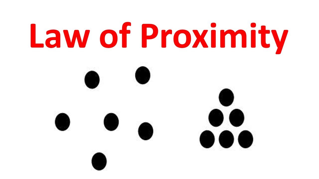
2. Proximity
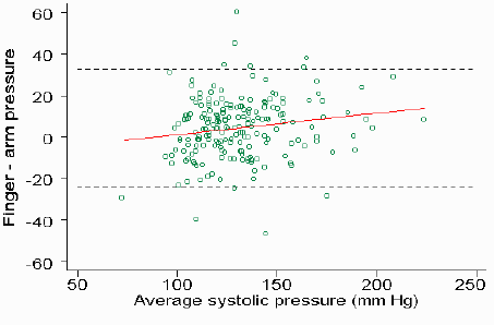
When you have items next to each other or near each other, they are perceived as being grouped – and therefore similar. In Figure 4, the group on the right is perceived as being more similar to each other than to the group on the left.f g In data visualization, this is relevant to scatter plots and multiple line charts. It may look like there is some relationship between variables because they are so concentrated. However, this red trend line reveals little to no correlation.
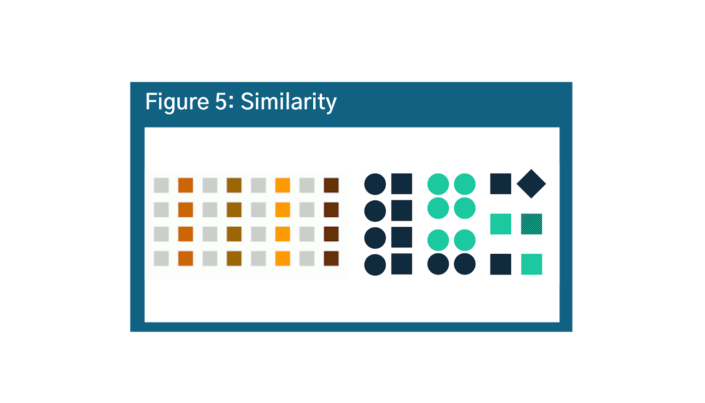
3. Similarity
Objects that are similar in shape, size, or color are going to be understood to be the same and distinct from others. However, the brain processes color faster than other types of categorization. In Figure 5, despite English speakers processing information from left to right, our brains will process color first (more on that below).h i The audience will automatically interpret the information to be grouped by color rather than rows, columns, or shapes. This gets messier in the bottom example. Our brain is trying to organize this group of objects, but there are two different shapes, two colors, and a variety of positions. So, it is more challenging for our brains to put this information into groups.
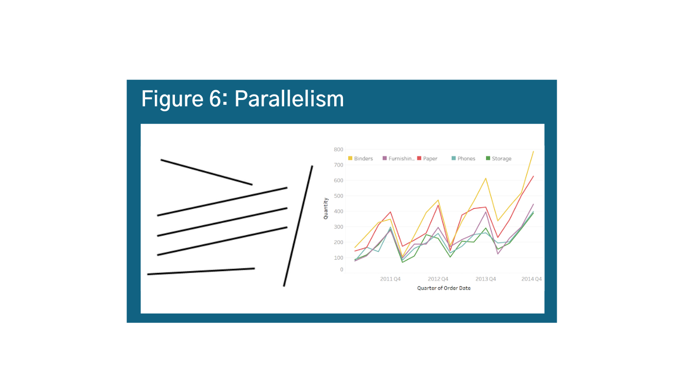
4. Parallelism
Elements that are parallel are assumed to be together, and also different than the elements that are not parallel. This is an important consideration as you want to be careful not to suggest correlation or causation if there is not one. However in general, parallelism is a helpful principle in data visualization because it means that line graphs are intuitive ways for people to observe trends, as is shown in Figure 6.j k
5. Common Fate
With objects in motion, our brains interpret those that are going in the same direction as “similar” and those that are not as dissimilar. This principle applies to movement, but is still important for data visualization. When looking at a visual like the example, your eyes will be drawn to the area where the dots are concentrating. This usually means that there are observable patterns worth investigating in the data. Be cautious that your graphics are not so focused on the movements towards the cluster that readers lose the story. In the example of Figure 7, there are outlier dots that are moving way off the grid that could be more important to your story.l
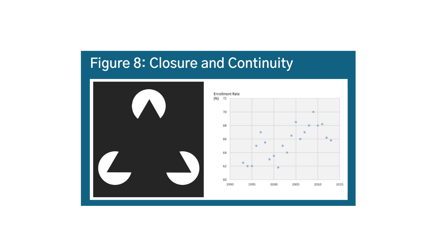
6. Closure and Continuity
Our brains automatically complete the picture to see things that are not there. In Figure 8, we really want to connect the dots, and our instinct will tell us that the line should continue going up.m n However, if you look at the two most recent data points, you will see that the trend might actually suggest that the values are going down. It is important to consider this principle in scatter plots and when thinking about trends.


Jastrow Illusion
The Jastrow Illusion is helpful when thinking about circles and arcs. In the graphic of Figure 9, the outside segment (the one on top) looks smaller, but they are actually the same size.o Our brains are hard-wired to process the relative differences in sizes of squares and rectangles – but not circles and arcs. This becomes especially problematic with donut charts, semi-circles, and radar charts; and explains why bar charts and line charts are more intuitive.
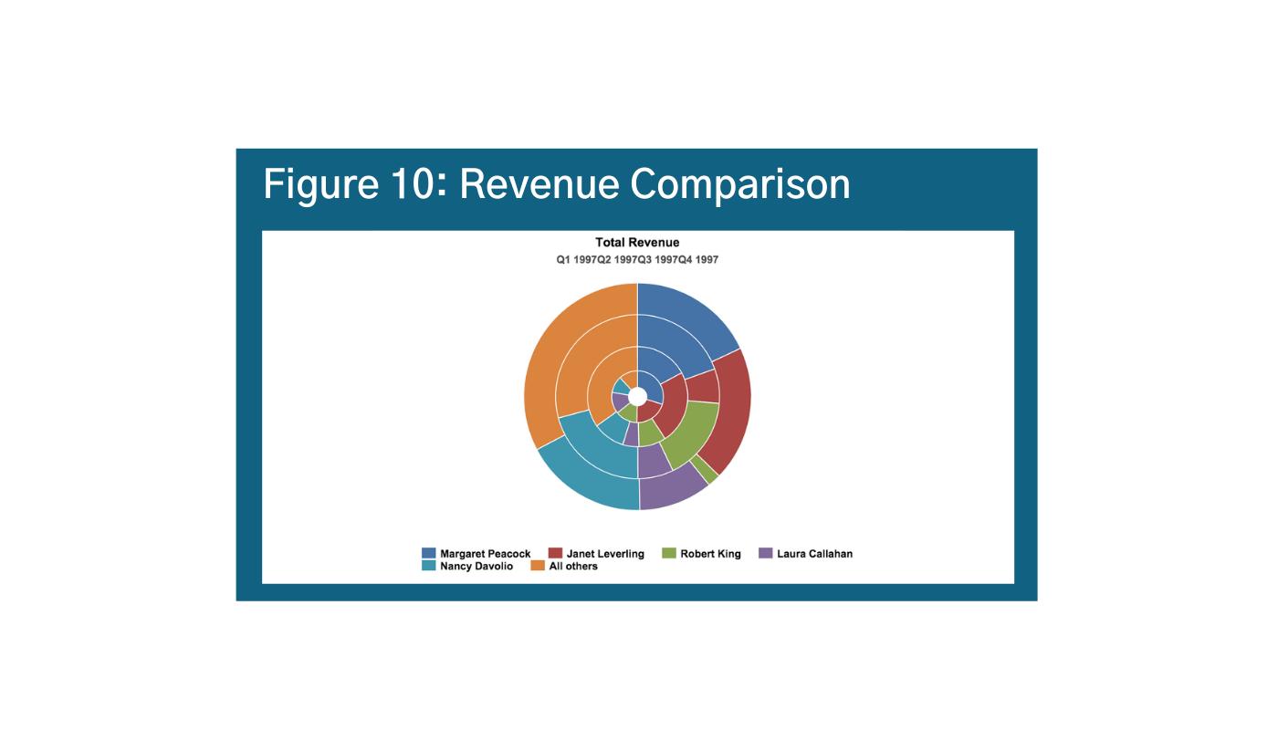
The Jastrow Illusion is visible in Figure 10 below.p Can you easily differentiate between Nancy’s revenue from Q1-Q2 in Figure 10? Or if Nancy’s revenue is higher than Margaret’s?
Alternatives could include stacked bars and columns for absolute values, 100% stacked bar column, stacked area charts or 100% stacked area charts, or treemaps.
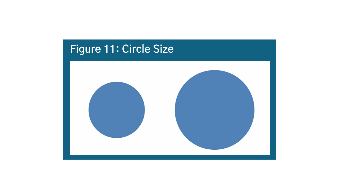
The principle holds for circles as well. In Figure 11, How much larger is the area of the right circle than the left circle?q Answer: the circle on the right is TWICE the area of the circle on the left. This shows that our brains have a hard time distinguishing between relative volumes of circles as well. While circles are generally more aesthetically pleasing, default to squares and rectangles.

Part 2: Visual Hierarchy
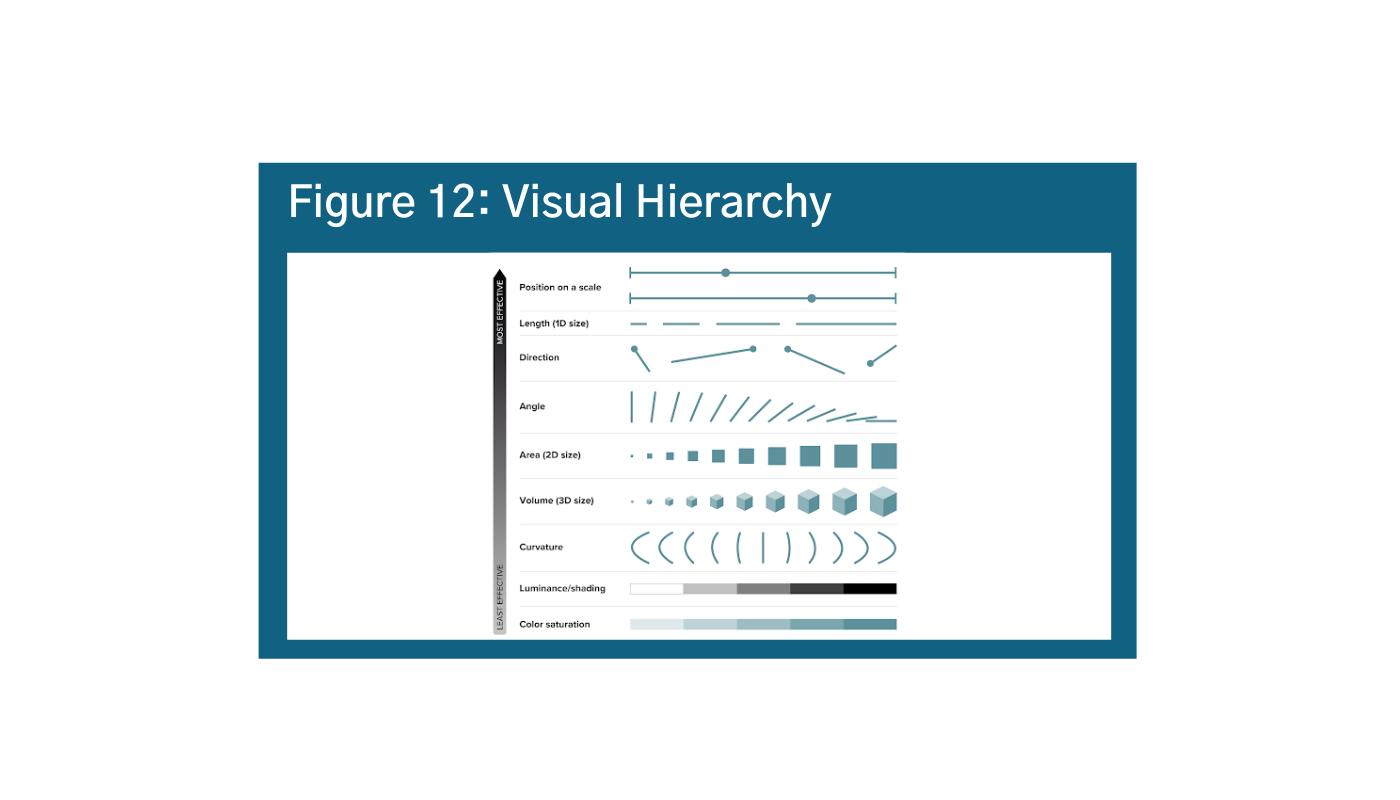
The human brain does not process all visual cues at the same time. Figure 12 below summarizes the visual information hierarchy, that is which elements of visual perception humans process first or most intuitively.r
As is shown, position on a scale or a single axis is the most intuitive and easily understood data visualization; angles, area, and volume are somewhere in the middle; curvature, shading, and color saturation are the least intuitive. It is a good idea to try and stick to the most easily understood elements when possible with a low data-literacy audience.
What does this mean? Bar graphs and line graphs are generally going to be the most intuitive. When in doubt, ask yourself why not a bar graph? It also means that it’s important to think critically about your color choices, especially for audiences with lower data literacy.
Components of Visual Hierarchy
Position
Position is the most immediate and intuitive visual element. This is the reason line charts and bar charts are so intuitive: we know to process the information on a scale from zero to infinity vertically, and from zero or beginning to end looking from left to right on a line chart.
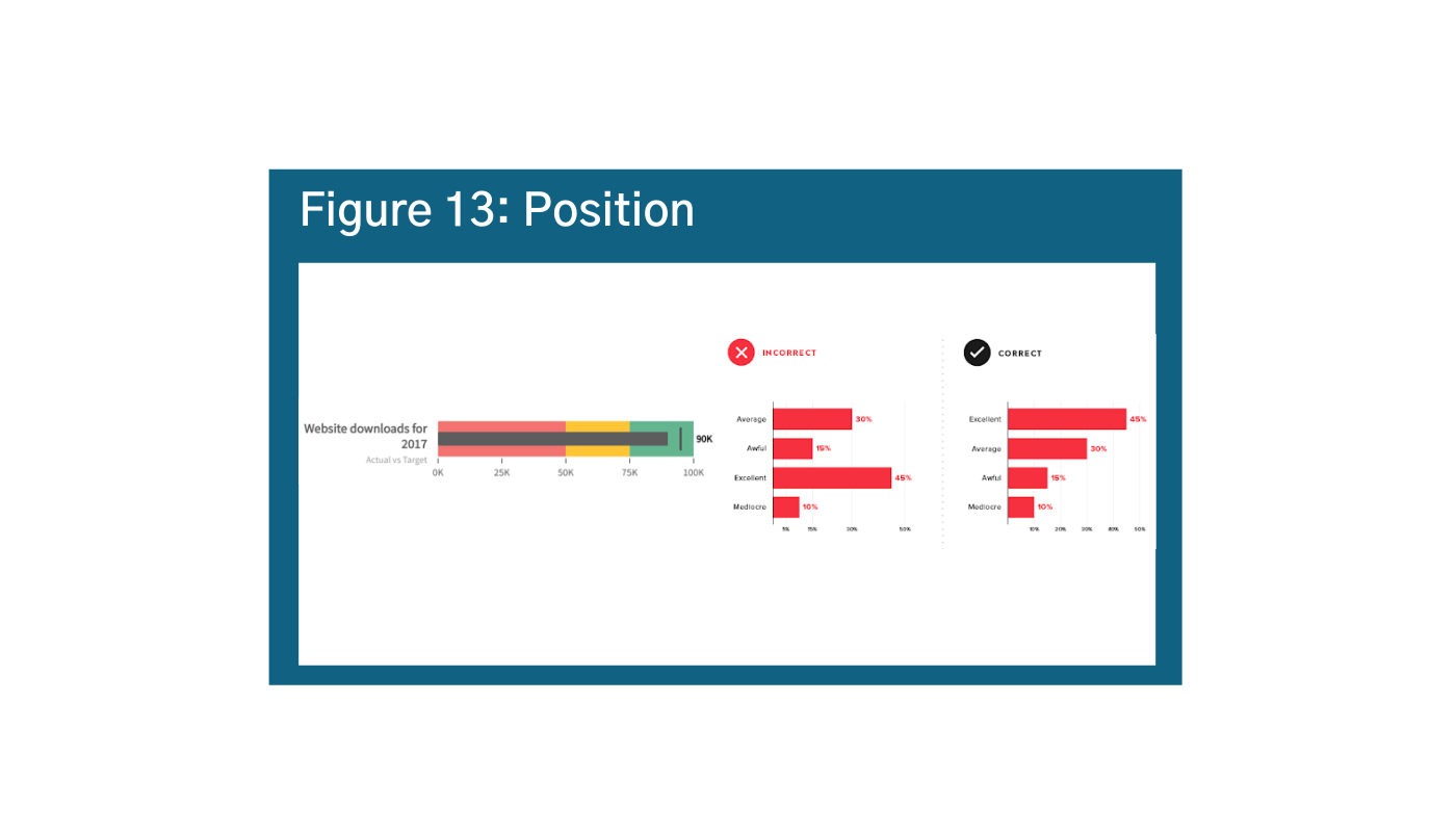
Try to arrange your data in order quantitatively to get your message across, and pay close attention to how your scale affects position (more on that below). In Figure 13, there are a few ways to arrange your data: either from most common to least common answer, as you see here, or you can arrange it from “best” to “worst” – depending on your data story.s t The layout options are somewhat dependent on your data, as rules created by the data will dictate position on an x and y-axis.
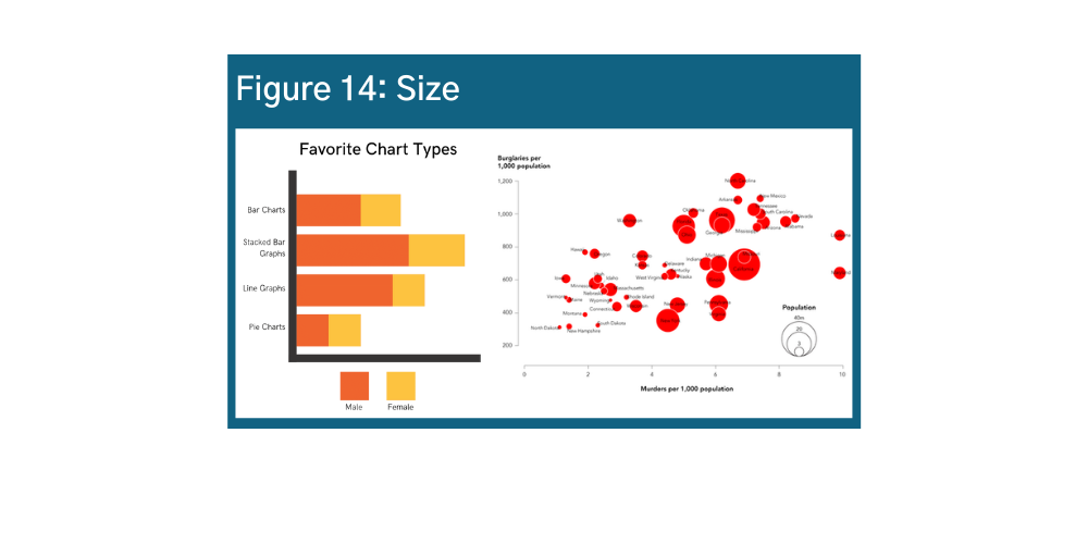
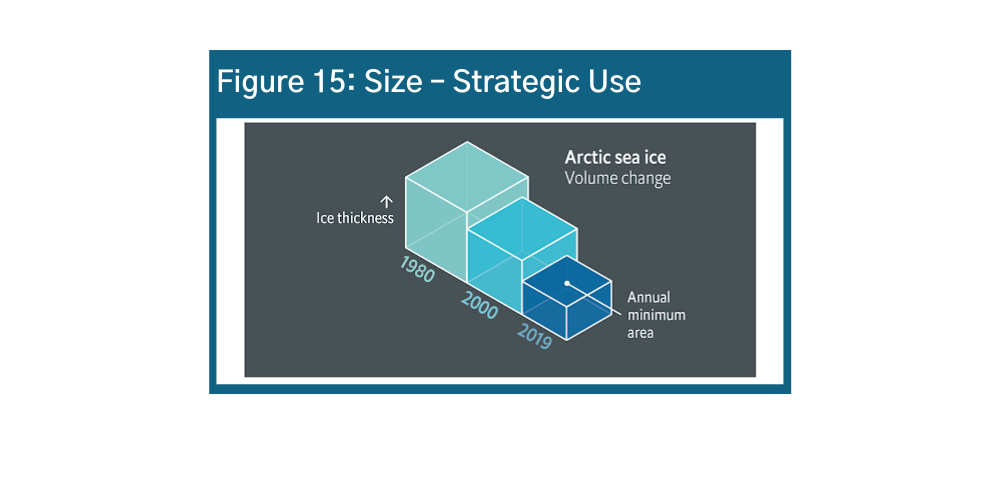
Size
Size is the second most intuitive visual element. Size communicates different quantities in bar charts but also can convey additional variables as shown below in Figures 14 and 15.u v w Size is a strategic way to visualize information in infographics. However, it can also be used very carelessly – be sure to consider how the size of your icons or images might suggest something about your data story, and make sure that the sizes you are using are actually proportional to the data values they represent.
Color
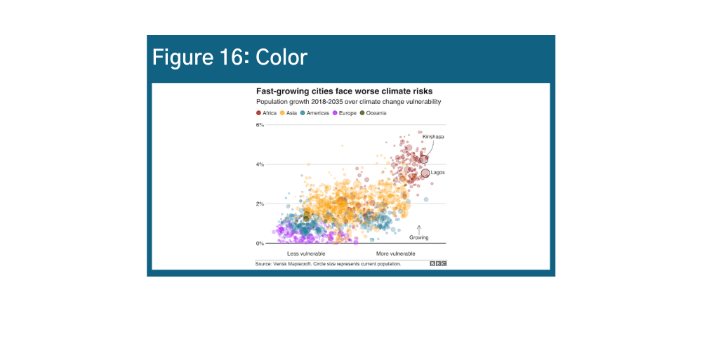
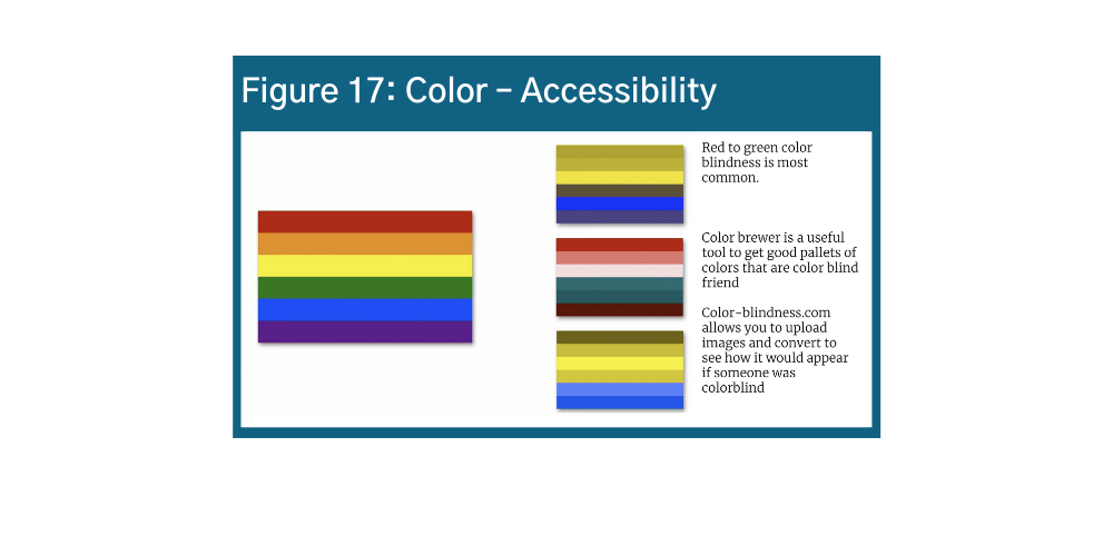
Color is a very powerful visualization tool because it draws the eye to areas of emphasis, exemplified in Figures 16 and 17.x y It is a great tool when used well – for example, as a fourth variable in a bubble chart. When used poorly, it not only distracts but could misdirect the user. Do not use color just for color’s sake – use it wisely in your data visualization design.
One important caveat in using color! Around 5% of the population globally and 8% of the population in North America experiences colorblindness. Red to green color blindness is most common. The same challenges often affect people with visual impairments. It is crucial to consider these individuals when selecting color. Color Brewer is a useful tool to get good pallets of colors that are color blind friendly. Another option is uploading images to Colblinder’s Color Blindness Simulator, which shows how the images would appear to someone with color blindness.
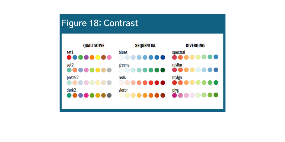
Contrast
Another way to consider color is opacity and transparency. The opacity of color usually shows strength or magnitude. A few examples of the different kinds of messages that you can convey with colors.
- Darker colors convey increasing intensity or concentration
- Distinct colors convey distinct variables: e.g., number of people
- Diverging variables convey ranges and spectrums, such as good/bad
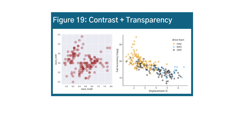
Transparency is important too, especially for visualizations with many data points. There are ways that you can play with contrast and transparency to enhance your data story. Take a look at Figures 18 and 19 for examples.z aa ab
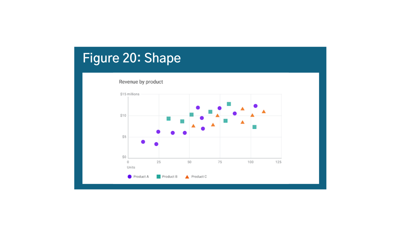
Shape
When combined with colors or other elements, adding shapes can be very effective mechanisms of differentiation. Shapes are not on our visual hierarchy scale, but they usually come last because it takes our brain a relatively long time to process different shapes, and color is always processed before shapes. Again, use cautiously because in visualizations with too many data points, the meaning can get lost (Figure 20).ac
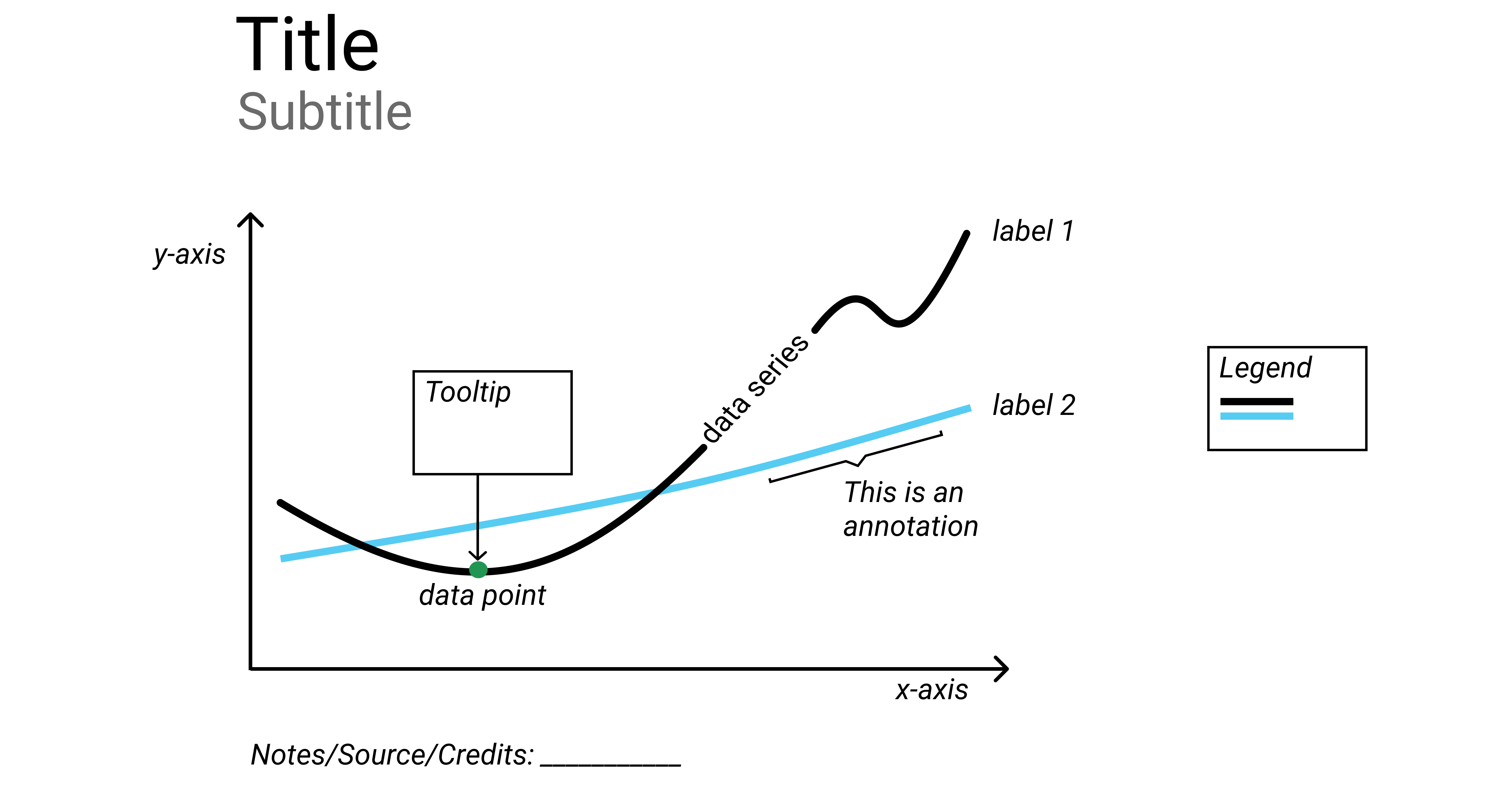
Part 3: Anatomy of a Data Visualization
Even basic data visualizations require visual cues to process information. These elements are often taken for granted, but they can help (or hurt) your story. Now that we know how our brains process information, we will discuss how to enhance your data storytelling with these data visualization cues.
Scale
Scale is critically important. The graph in Figure 21 shows how the same data on different scales. Manipulating the scale can change the message (recall “position” is first on the visual processing hierarchy), and is fairly common.ad
Fixing this one is easy. The first rule of scales is that bar charts should always start at zero. Unlike line charts, the volume expressed by the bar is proportional to the value of the variables and data that the bar is representing. That is why it is critically important that all bar charts start at zero – so there is no misinterpretation or skewed perspective.
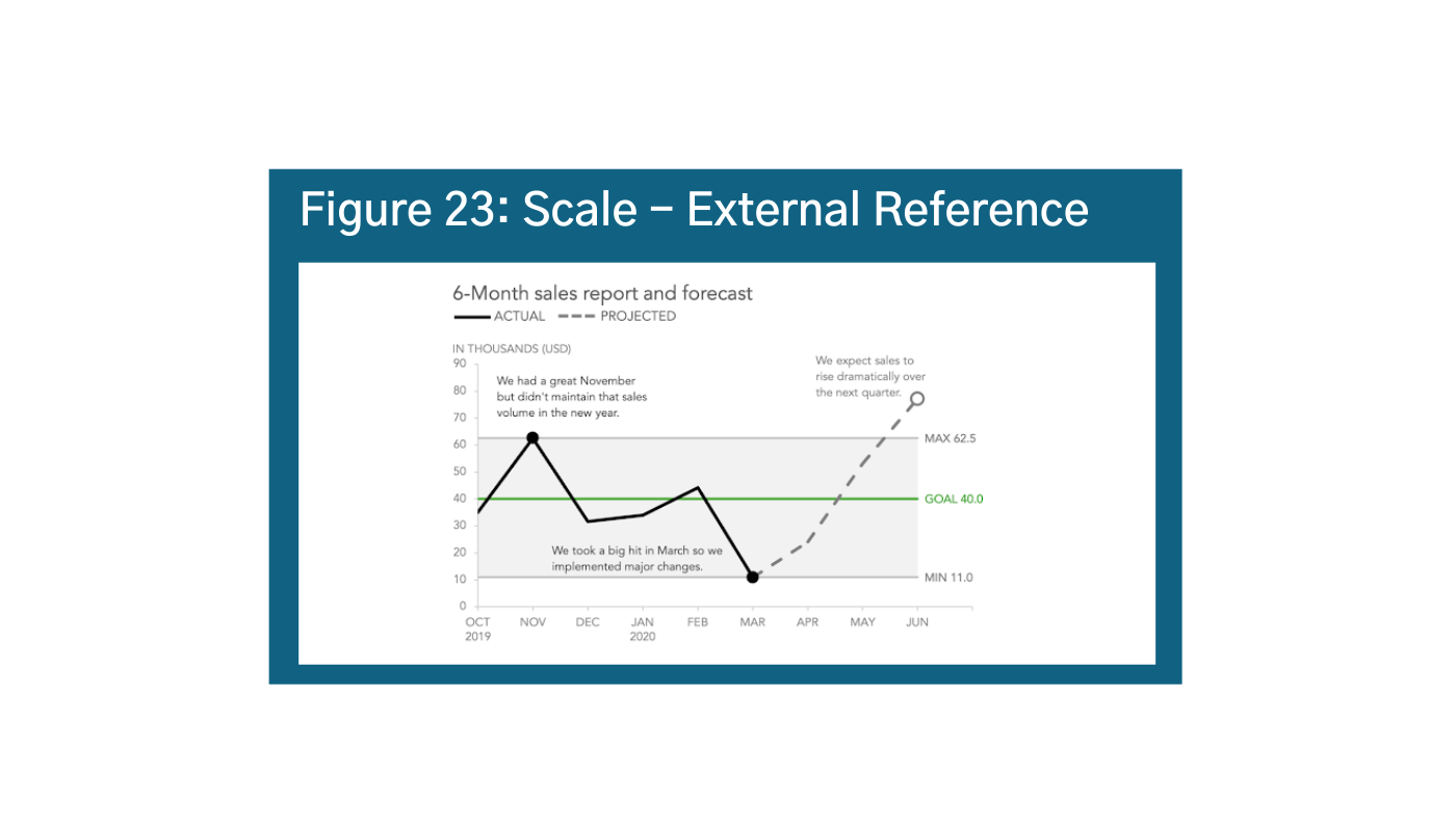
A second component for consideration is your internal reference: are you comparing things within the context of the chart as in Figure 22?ae Visually, the most accurate scale would be to balance the start and end of the scale or the actual range of your data. For example, if your data starts at 4472 and goes to 1000, your scale should be 4471 to 10,472. However people are much better at using round numbers, so you should also aim round when possible. You can also supplement your scale with external references to further drive home your story as in Figure 23.af
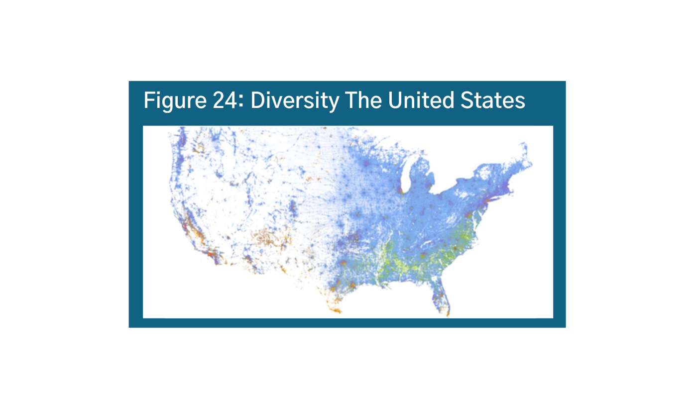
Scale is critically important for maps as well. When making maps, make sure zooming in and out doesn’t distort your story. Because of the overall US population, this map does not show, for example, the diversity of Washington, DC (Figure 24 and Figure 25).ag ah
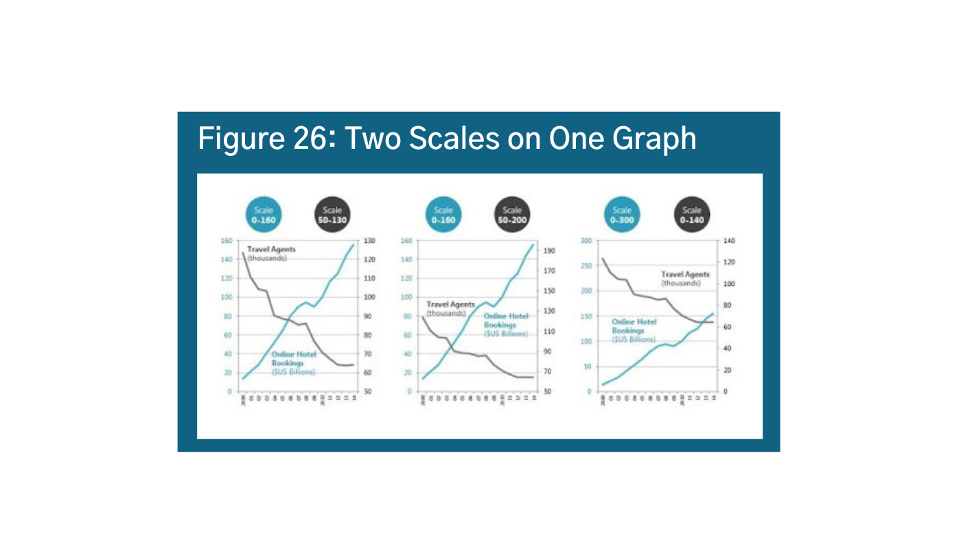
At the same time, using two different scales at the same time or two y-axes can distort your story. It is used often to convey opinions that may not be totally valid given the data. In Figure 26, the messaging in these three visualizations is very different depending on how you set the scale.ai Instead of using two scales, try normalizing your data as a percentage, rank, range, or just split them up into side-by-side graphs. Look at your chart with different scales to see what might be the best fit. Additionally, it is important to consider your audience in terms of accuracy. What will people who do not know the story or the data think? Think about skeptics and believers – how will they perceive the information?


Labels
Labels are a great way to convey information and represent data. But, it is important to be smart about your data labels. Grey is a good idea because axes and labels are the context, not the main idea, so you do not necessarily want to draw your eye to it unnecessarily. In Figure 27, the labels make it difficult to read the visualization.aj If labels are really important, consider making the labels your data points, using callouts, or hovers. All axes and legends should have labels. Consider callouts, or flipping your axis horizontally to make it easier to label data (Figure 28).ak In-line labeling is best, do not make your audience tilt their heads. Additionally, it is okay to explain to the reader what they are seeing. Think about labels as if you knew nothing. What information should be labeled to understand the whole picture? In some cases, you can even create a “how-to” for reading the data. The New York Times (Figure 29)al did a really great job of explaining exactly what epidemiologic terms mean. In the early days of the pandemic, it really helped separate hyped statistics versus areas of real concern.


Legends
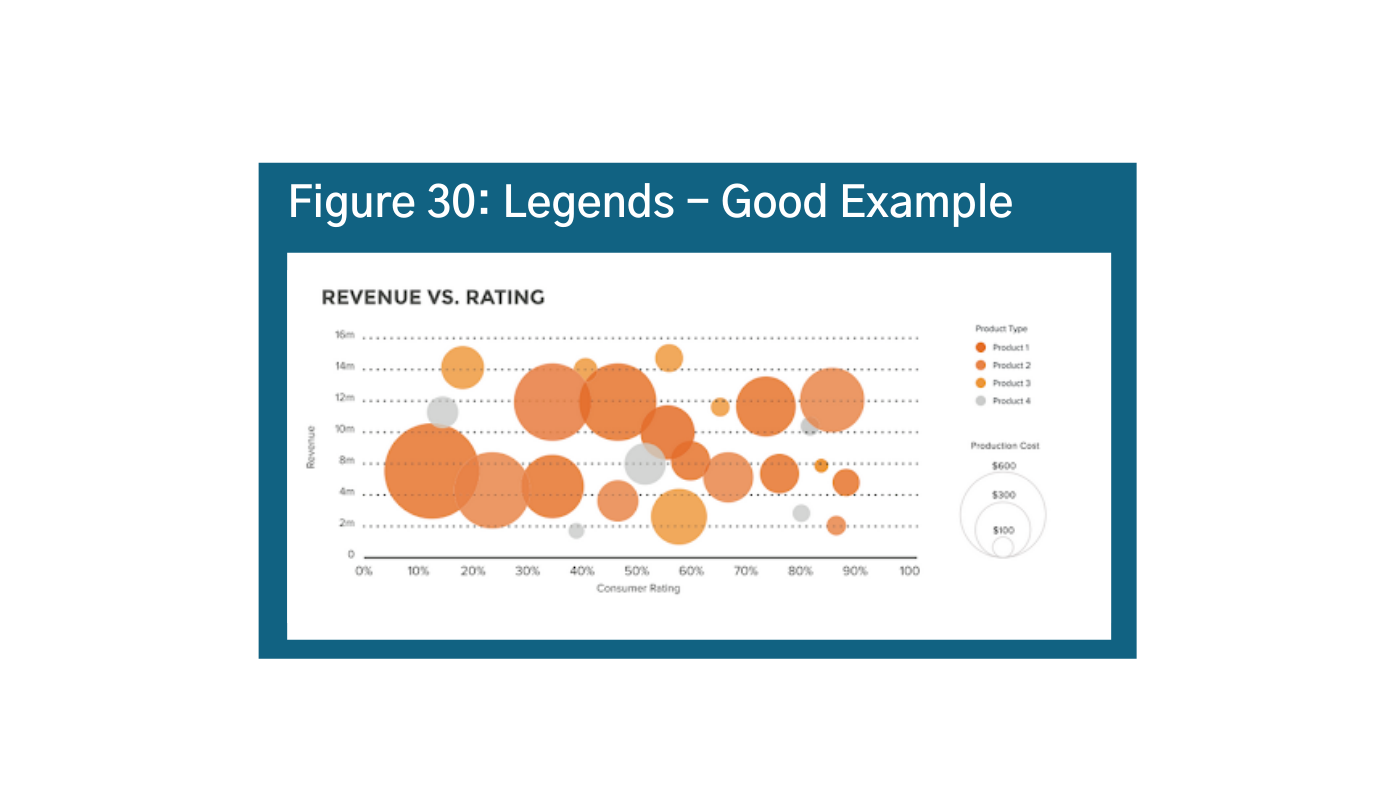
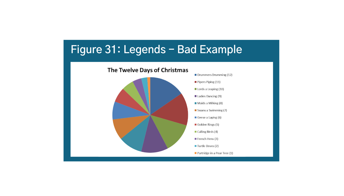
Data legends are explanatory cues that describe your data. They are often found in the bottom right hand corner, so it is generally a good idea to place them there when you can be consistent. The key with legends is to effectively use visual cues like color, shape, and size to keep the audience’s eyes on the data and avoid back and forth (Figure 30).am Another important tip is to keep it simple. You do not want too many elements in your legend or it gets hard to follow and the reader has to keep going back and forth between the visual and the legend (Figure 31).an
Callouts
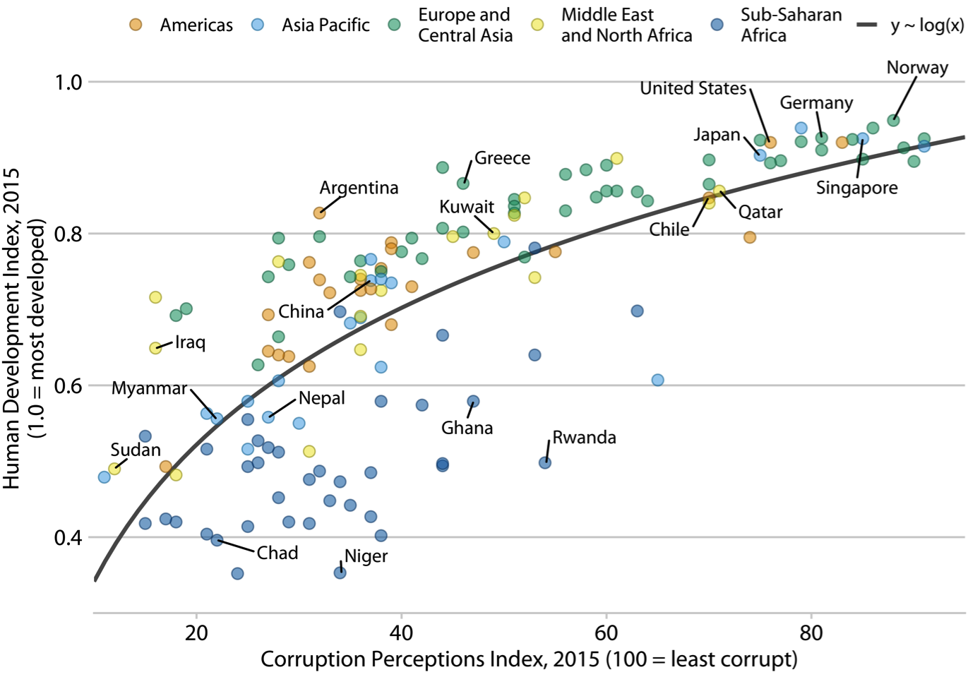
Callouts are helpful in guiding the viewer and use supplementary information to help draw attention to a main idea. A callout can be just a bigger data label if that data point is your most important/main idea. Figure 32 is not a terrible use of callouts, and it is selectively labeling a few countries (remember how this can bias your story!)ao However, it is unclear what the value-add is, and it makes the visualization a bit messy. Figure 33 is a better example.ap Here the callouts are used to tell a story and to provide additional context.


Illustration and Iconography
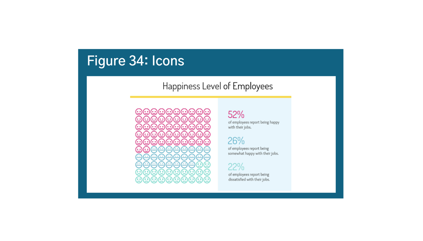
Large thematic images (illustrations) and smaller icons (iconography) help draw attention and reinforce the meaning of your graphic. The use of human icons is especially effective when communicating or advocating for a human element. People relate well to images of other people or illustrations that show emotions. Notice how when you look at Figure 34, just the numbers, 52% happy and 26% somewhat happy seems pretty good, but when you look at the iconography, you realize that there are not actually that many happy faces compared to unhappy faces.aq
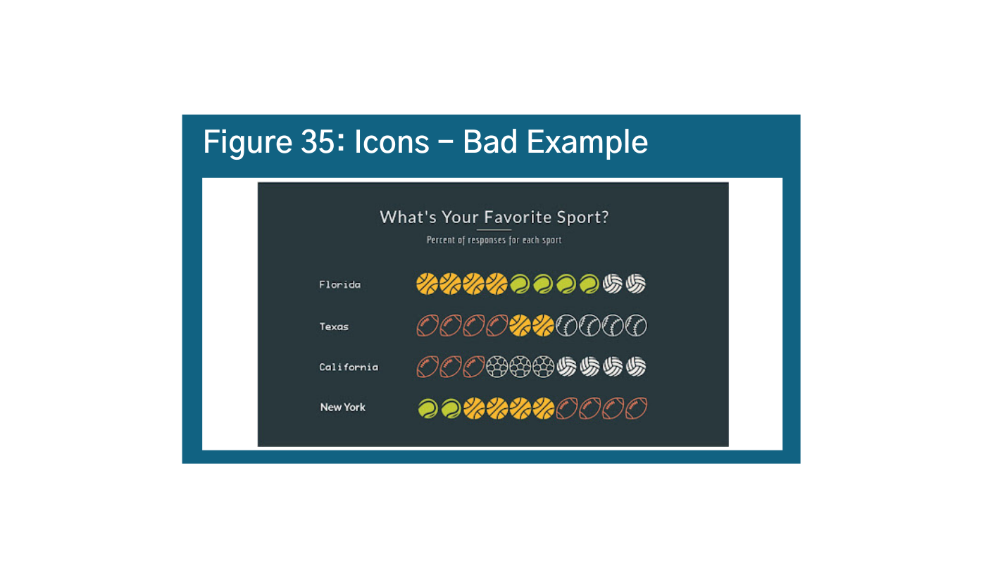
Be careful not to go overboard on iconography. In Figure 35, the favorite sport of each state is not readily apparent.ar How long does it take the viewer to understand the favorite sports across four states? In one state? If you knew nothing about sports culture in Florida, Texas, California, or New York does this even mean anything to you? It is important to remember that it is harder to read real relative values of a bar chart when data visualizations use icons rather than columns. Perhaps a better option would rearrange the data from highest to lowest as mentioned before.
Typography
Typography is often seen as an afterthought in data visualization, but it is also important to be intentional about the typography you are using. First, making the axis gray or smaller helps ensure that it is understood as context rather than the main story. It is also important to label everything uniformly, keeping the type size, font, and color of each element consistent (Figure 36).as Notes on the data (sources) and notes on the technology should be included at the bottom of each visual.

Bonus: Interesting Examples
When designed with the user – and their brains – in mind, data visualizations can be a very effective tool for processing and understanding large sets of information. The following are examples that we found particularly interesting.
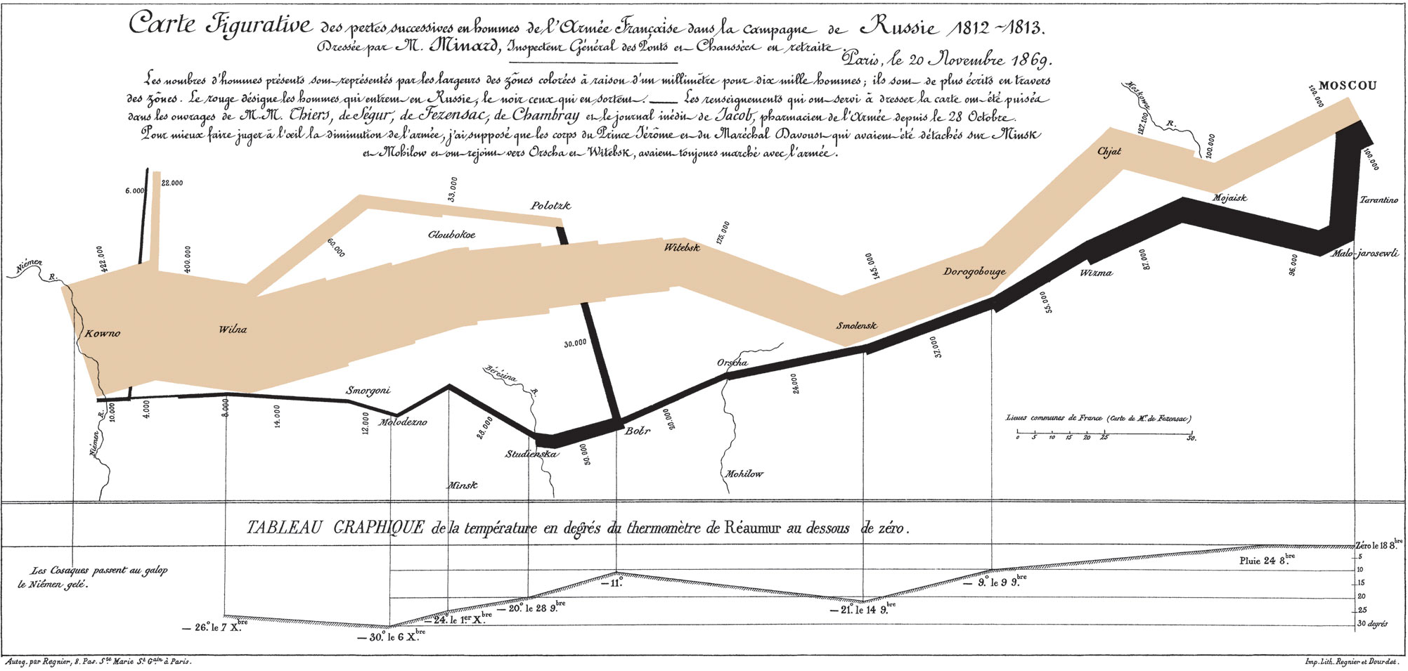
First, One of the earliest data visualizations is of Napoleon’s 1812-1813 Russian campaign by Charles Menard. The size of the lines is proportional to the size of the army on the way to Moscow and on his return. It is an interesting way to show scale across time and geography.
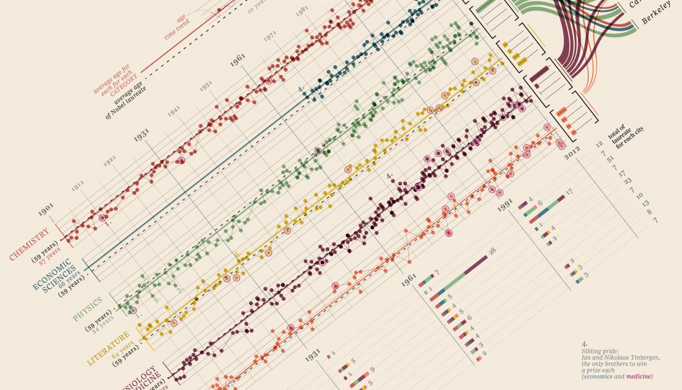
Next, the visualization of Nobel Prizes and Laureates is a useful example for the creative way it displays a tremendous amount of information without being overwhelming. The visualization is really rich in types of data.
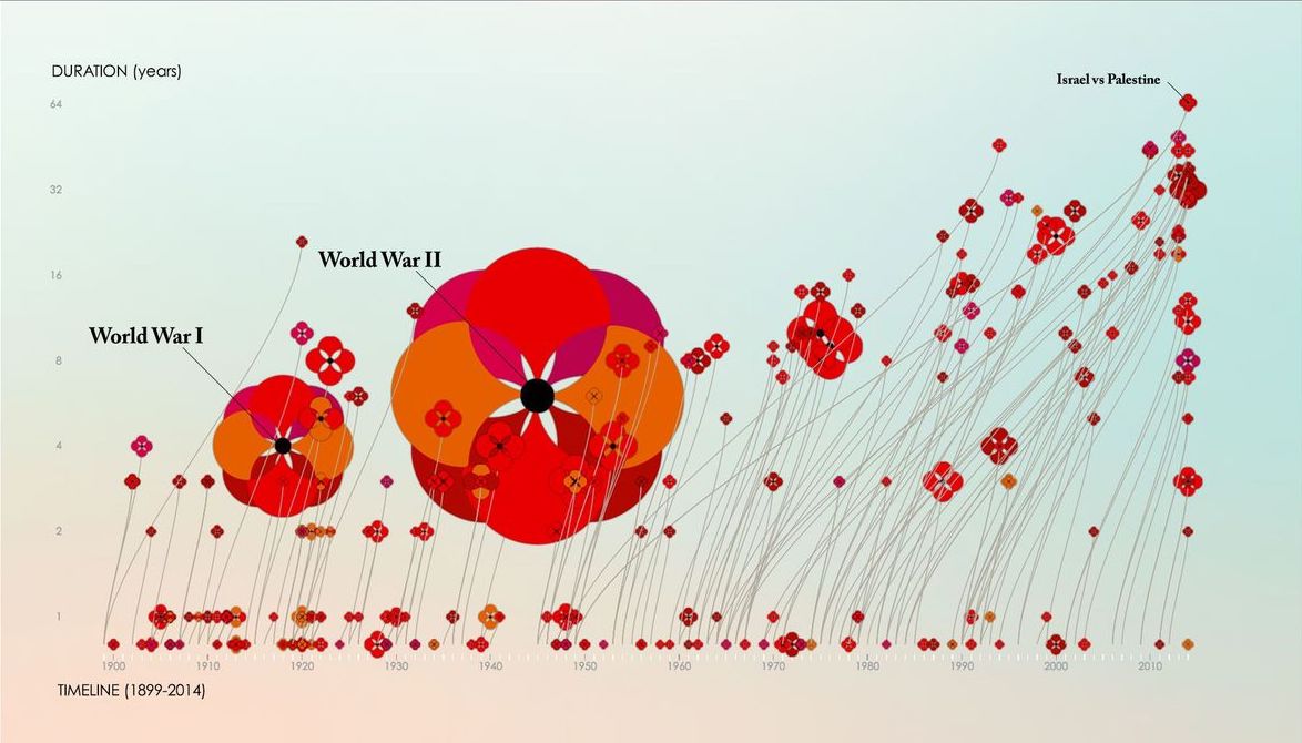
Finally, The Poppy Diagram is another artistic way to present information. The size of the poppy flowers displays information about the number of fatalities, the curvature of the stem shows duration of the conflict, and the petals show the regions involved.
At DG, we are always interested in learning more about how different kinds of audiences respond to data visualizations – and what are universal best practices. You can learn more about our findings from the other blogs in this series, or share your data visualization resources with us on social media.
Share
Related Posts
What’s Your Story and How Can Data Help Tell It?
For as long as Development Gateway has specialized in data, we have also specialized in data visualizations. In that time, we have discovered the pitfalls and learned ways that data visualizations can increase data use. In this post, we look specifically at selecting the right type of visualization for the story you want to tell.
The Building Blocks for Successful Data Visualization Tools
In 2020, we sought to answer a pivotal question: what are the good practices and lessons learned from the many existing women’s, children's, and adolescent’s health data visualization tools? In partnership with UNICEF, DG worked to identify good practices, as well as to determine any differences for emergency-focused data visualization tools, using COVID-19 as a test case.
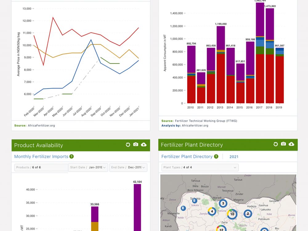
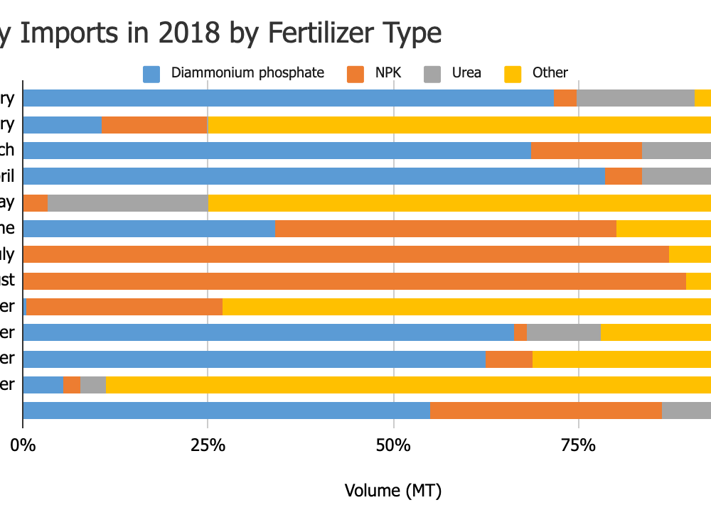
Changing the Data Landscape: The VIFAA Nigeria Dashboard
In place of unwieldy spreadsheets and dozens of sources, the VIFAA Fertilizer Dashboard introduces a “one-stop-shop” for trustworthy, visually appealing information that is key to understanding Nigeria’s fertilizer sector.