AD3ventures in Mapping
Administrative data – data from civil registration and vital statistics systems, and sectoral (health, education, judicial, social protection) management information systems – is rich with insights on citizen needs and priorities. Though timely and disaggregated administrative data can complement official statistics, it comes with its own data quality, availability, and use challenges. Through our Administrative Data-Driven Decisions (AD3) program in Senegal in partnership with the William & Flora Hewlett Foundation, DG is working with the National Civil Aviation and Meteorology Authority (ANACIM) and the food security Multidisciplinary Working Group (Groupe de Travail Pluridisciplinaire or GTP). The group is constituted of government actors from technical services in charge of agriculture, hydrology, livestock, food safety, fisheries, plant protection, the Ecological Monitoring Centre, the Public Health Service Department; private actors like journalists, research institutes; technical and financial partners (WFP, USAID, FAO); and Civil Society Organizations. AD3’s goal is to use administrative data to support GTP members to better inform early warning and preventative measures for food security.
Through AD3, we built a dashboard that focuses on climate, market prices, livestock diseases, river levels, and annual rainfall, among other themes. While the dashboard itself is a useful repository of information, looking at how we developed the maps and iterated on user feedback is a way to identify good practices in data visualization. Let’s take one example of how we approached this: visualizing annual rainfall.
For DG, the first step in designing any visualization is to understand what data is available and to identify the user story – i.e. what do users do (or want to do) with the data? The user story helps us to understand what type of decisions users need to make with the data and determine what type of analysis may be most appropriate.
In the case of rainfall, ANACIM collects the total rainfall per day in millimeters at 22 rainfall stations throughout the country. Using rainfall data over the past ten years, ANACIM establishes an average rainfall per location, called the normal. This serves as the reference amount of rain that the location should receive at any point in time.
During a co-design workshop with the GTP, we learned that users need to identify when and where abnormal rain patterns occur and understand how these may affect agricultural production. For example, understanding the onset of drought can help policymakers and planners take action to reduce potential harms to food security.
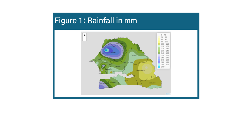
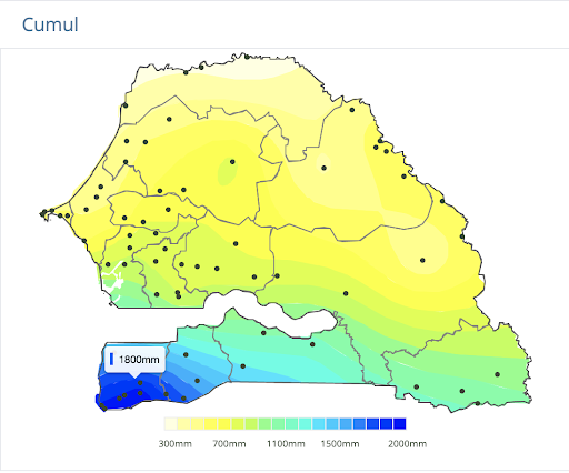
One way to visualize rainfall data is to display the amount of rainfall per decadal (10-day period) on a map. With this information, users can easily see how much it has rained across the country.
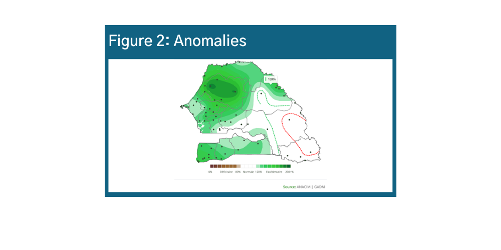
Knowing how much rain has fallen in a location is important, but is not enough information to know if an alert should be activated. For example, low levels of rainfall in Tambacounda in early May might be the usual rain pattern for Tambacounda, and as such the population likely already has systems in place to respond, for example by delaying the start of planting. To identify if a rainfall pattern will affect food security, the GTP members need to know if that level of rain is abnormal for the location. To visualize this, we created a map that shows the percentage difference between the amount of rain received in a location and the normal rainfall in that location during the past decadal. Figure 2 is an anomalies map, which shows the percentage difference between actual rain and normal rainfall amounts.
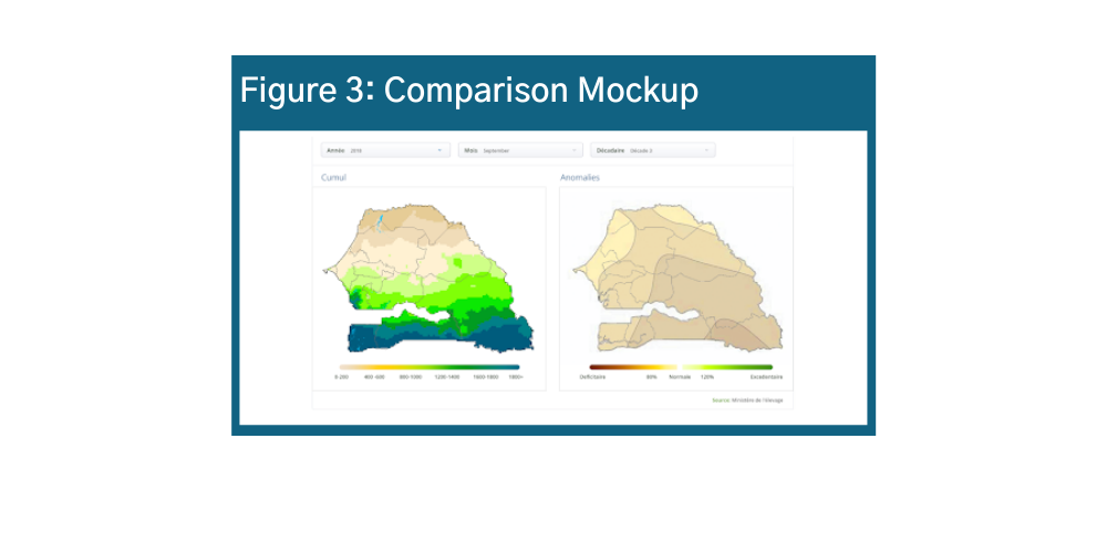
As a final step in the design of this visualization, users mentioned it was important to see both maps next to each other, and to be able to compare both maps for the same time period. In response, we created an interface that allows the user to apply filters that affect both maps at the same time. Figure 3 shows the mockup for an interface with two maps using a single filter interface.
In addition to designing a visualization that responds to user needs for data analysis, we also focus on making visualizations that are clear and easy to understand.
The map on the right is a first prototype for the map of rainfall in mm. This version was based on a map that was created by ANACIM and shared with GTP members in PDF format. As you see on the map, the numbers in the legend do not have units. It is important to always include the unit for any visualization, for example, rainfall reported in millimeters. Secondly, legends can be overwhelming when there is a lot of information. For a PDF version of the report, it is important for users to be able to easily associate each color with the corresponding category of rainfall.
A benefit of an online dashboard is the ability for users to interact with the visualization. In the case of the map, users can hover over any location and see the exact amount of rainfall. As a result, we were able to design a map legend with fewer numbers.
The dashboard was finalized and launched last year along with a training plan for our partners.
Share
Related Posts

AD3: Co-design Workshop of the Multi-disciplinary Working Group Dashboard | AD3: Atelier de co-conception du tableau de bord du Groupe de Travail Pluridisciplinaire
Last month, in partnership with the National Civil Aviation and Meteorology Authority (ANACIM), DG held a co-design workshop to better understand the visualization needs around agro-climatic data. We worked with ANACIM’s Multi-disciplinary Working Group (GTP), to reflect on the content and design of AD3’s interactive platform, and decided how best to present each indicator to facilitate decision-making.
Announcing AD3: Administrative Data-Driven Decisions
Development Gateway (DG) is proud to launch the Administrative Data-Driven Decisions (AD3) program, supported by the William and Flora Hewlett Foundation. Through this program, DG will work with governments in East and West Africa to improve the efficiency, effectiveness, and use of administrative data systems.

Data, Digital, and Policy at DG
Through dozens of implementations across a variety of sectors, countries & contexts, DG has seen firsthand what makes data, technology & evidence effective, and what can contribute to dormant systems filled with incomplete and unused data. Based on our history, relationships, and perspectives, we realized that DG had a lot to say.