Development Gateway and IREX Announce a Strategic Partnership
The IREX Board of Governors and the Development Gateway Board of Directors announced today a partnership that positions Development Gateway as a subsidiary of IREX. This partnership will enable the organizations to leverage data to support local leaders and global communities for more just, prosperous, and inclusive societies.
The partnership will combine IREX’s expertise, forward-leaning solutions, global footprint, and systems for tracking, measuring, and learning with Development Gateway’s innovative use of data, technology, and evidence. IREX and Development Gateway are poised to achieve even stronger results when empowering youth, building more effective and inclusive institutions, and improving education systems and learning outcomes.
Around the globe, communities are grappling with how to renew trust in public institutions and capitalize on the energy and creativity of the largest youth population in history. Data has become an indispensable tool to enhance not only the effectiveness of public institutions but also their legitimacy. However, if abused or misused, data can also become a driver of inequality, or even a threat to the safety of poor and marginalized communities across the globe. Timely and robust data is critical to measuring the performance of institutions and to the development and implementation of programs to address the massive challenges people around the world are facing.
“We are thrilled to welcome Development Gateway as a subsidiary of IREX and an integral part of our team,” said Kristin Lord, IREX President and CEO. “This partnership unites Development Gateway’s focus on data and technology with IREX’s focus on investing in people. Together, we will empower leaders from diverse backgrounds to build more effective institutions that are worthy of public trust.”
“Because of our shared values and mutual appreciation for the opportunities and threats of data and evidence, an IREX–Development Gateway partnership is a perfect fit,” said Josh Powell, Development Gateway CEO. “Together, IREX and Development Gateway can implement larger programs, create tools and services to reach new audiences, and help drive the global digital development policy agenda, all while meeting and exceeding donors’ growing expectations for monitoring, evaluation, and learning.”
Both organizations will continue to deliver high-quality results in all ongoing projects while also developing new lines of work. As a subsidiary of IREX, Development Gateway will be known as Development Gateway, an IREX venture. Kristin Lord will continue to serve as president and CEO of IREX, Josh Powell will continue to serve as CEO of Development Gateway, and Aleksander Dardeli will serve as executive vice president of IREX and chair of the Development Gateway Board of Directors.
“Over my years on the Board, Development Gateway has consistently worked to learn and grow as an organization seeking to reach its full potential,” said Adrianus Melkert, current Development Gateway Board of Directors Chair. “I am very excited about the way this transition into a strategic partnership will help Development Gateway expand and deepen its impact. I feel confident in the leadership of both organizations and am looking forward to seeing Development Gateway with IREX serving the people in developing countries that we want to support in fulfilling their aspirations.”
“I am very excited to work with Josh and the entire Development Gateway team to harness data as we try to better understand some of the most challenging problems that communities face and support their efforts to develop solutions,” said IREX Executive Vice President and incoming Development Gateway Board of Directors Chair Aleksander Dardeli. “I am confident that the IREX–Development Gateway partnership will accelerate our efforts to expand our impact, especially in Africa. Development Gateway’s technical expertise coupled with IREX’s geographic footprint sets the stage for innovative initiatives and new partnerships with like-minded organizations and donors.”
Share
Recent Posts

Signal vs Noise: Making Smart AI Choices
As the AI landscape evolves rapidly, it’s increasingly difficult to know which investments will last. This blog shares how Development Gateway uses sandboxing to test AI in controlled environments, focusing on efficiency, trust, and practical use cases while keeping humans in the loop.
Supporting Ethiopia’s National Soil Fertility and Health Action Plan
Declining soil fertility remains a major constraint on Ethiopia’s agricultural productivity. This blog reflects on the launch of the National Soil Fertility and Health Roadmap and DG’s support in its development, highlighting lessons on government-led reform and long-term resilience.
Development Gateway Collaborates with 50×2030 Initiative on Data Use in Agriculture
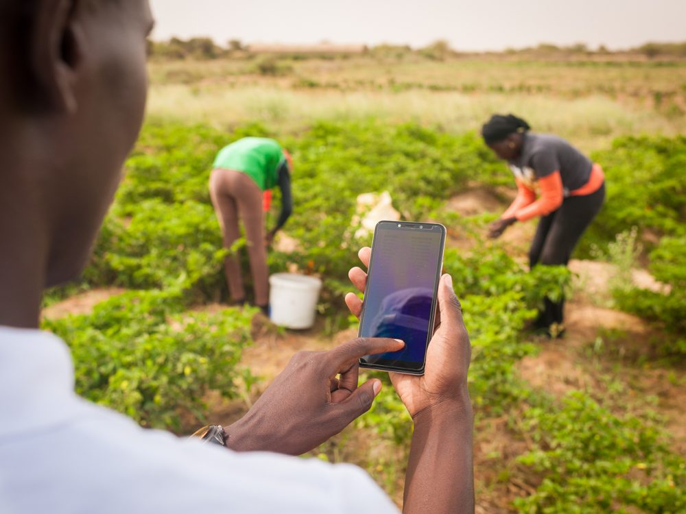
Development Gateway announces the launch of the Data Interoperability and Governance program to collaborate with the 50x2030 initiative on data use in agriculture in Senegal for evidence-based policymaking.
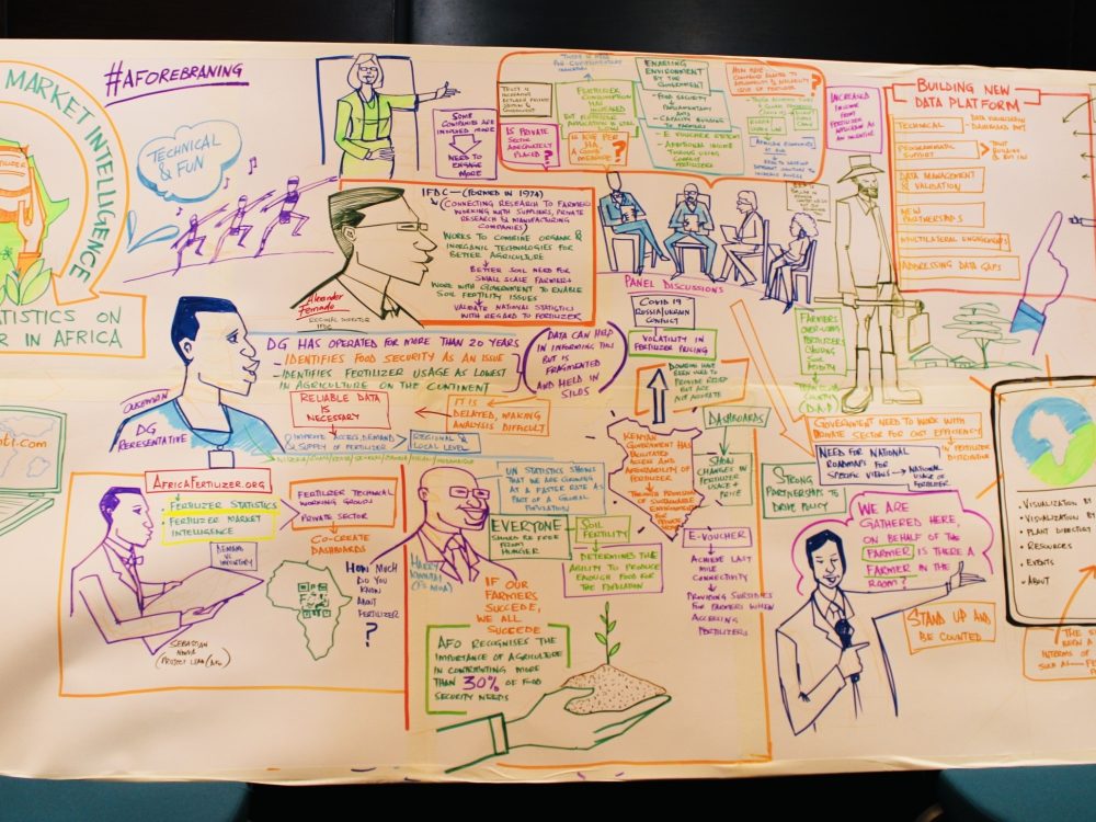
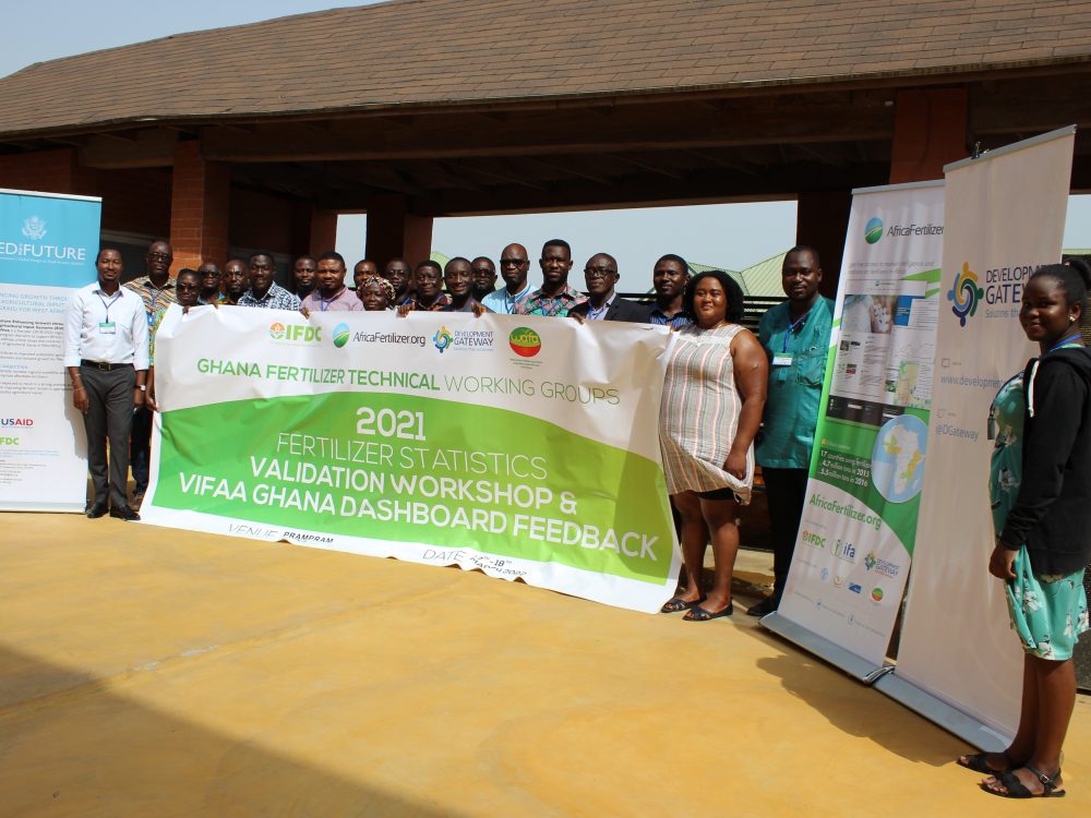
Why Does Ghana Need a Fertilizer Dashboard?
Through the Visualizing Insights on Fertilizer for African Agriculture (VIFAA) Program, Development Gateway – and partners International Fertilizer Development Center (IFDC) and AfricaFertlizer.org – aim to fill key fertilizer information gaps, increase data-driven policy and investment decisions in the fertilizer sector, and develop comprehensive, user-centered fertilizer data dashboards. The goal is to support development partners and the private sector to respond efficiently and effectively to changes in the fertilizer market, ensuring that sufficient quantities and appropriate fertilizers reach farmers at the right time for planting.
What Does the Dashboard Visualize?
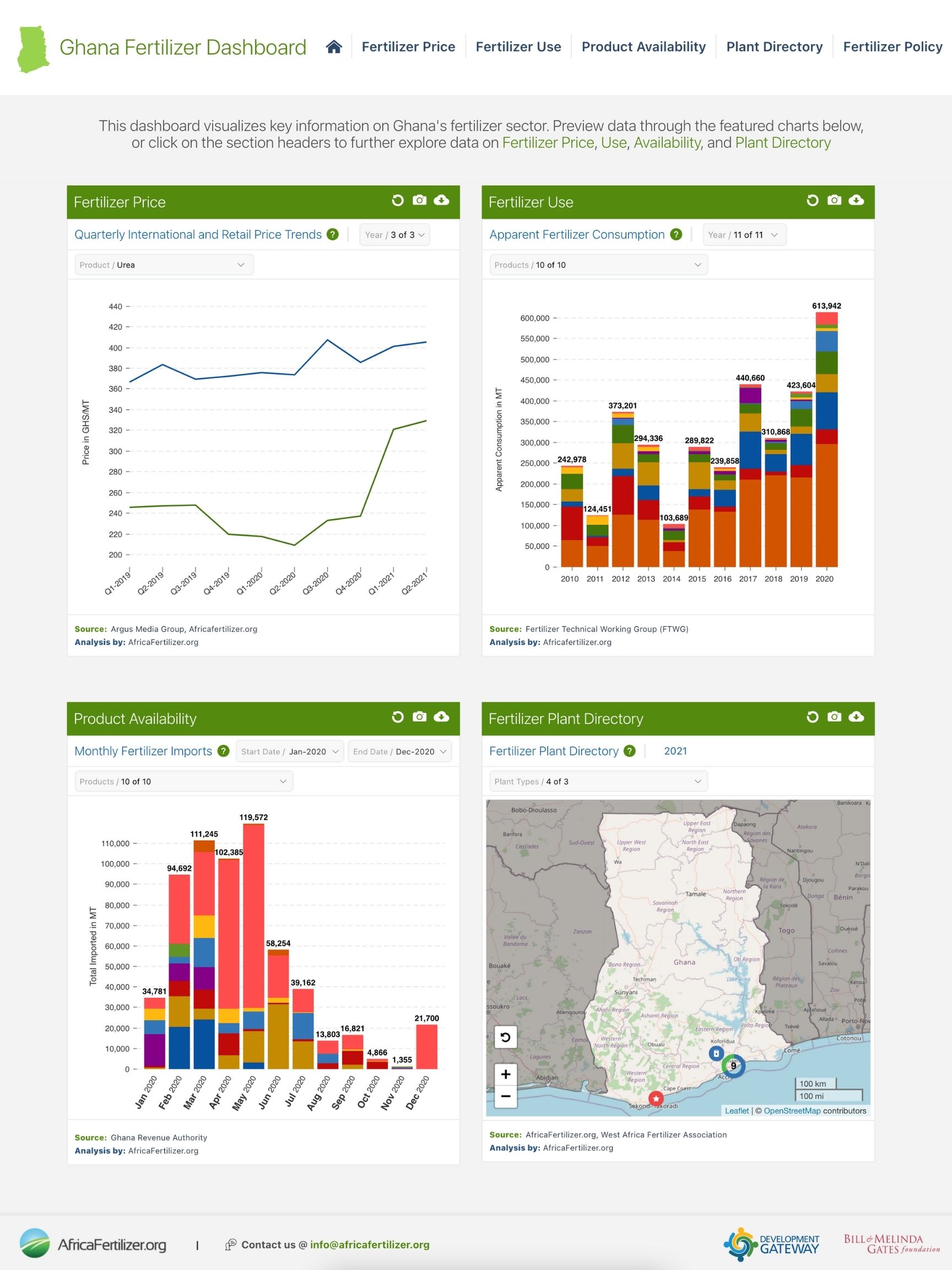
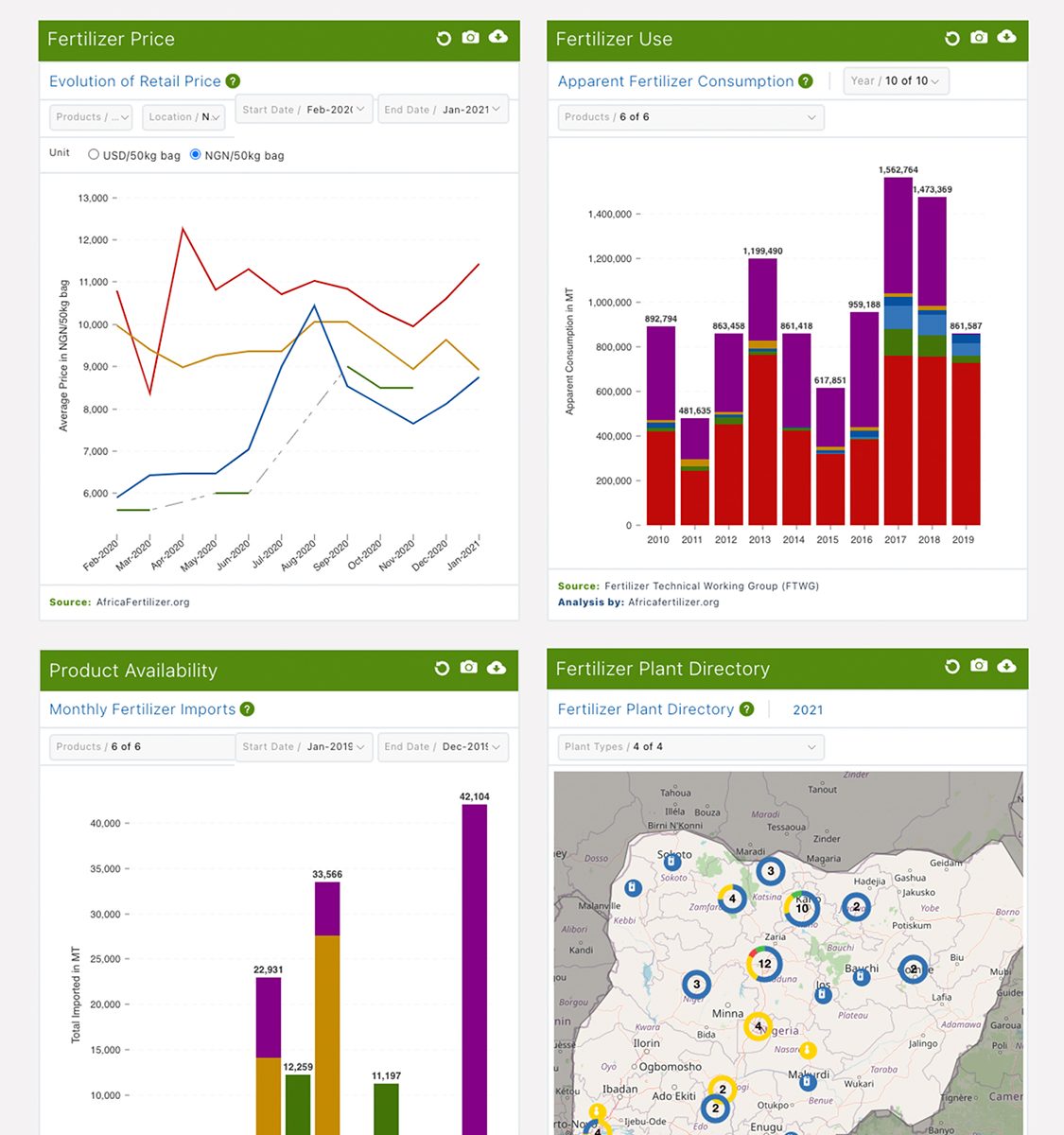
Fertilizer Usage – Sub-Saharan Africa (SSA) has the lowest fertilizer usage in the world – insufficient to replace soil nutrients lost every year to crop production. In 2006, the Abuja Declaration on Fertilizer for an African Green Revolution set 50 kg/ha as the primary target to reach. In Ghana, the current level of fertilizer use is 35.75 kg/ha. For nine years, AFO has been working with the Fertilizer Technical Working Group in Ghana to gather and validate the necessary data to calculate apparent fertilizer consumption. The dashboard then uses the apparent consumption data and FAO national cropland data to calculate national average apparent fertilizer consumption at the nutrient level, compared to the 50kg/ha Abuja target. This data is key to understanding where Ghana stands in its efforts to reach its fertilizer targets.
Level of Subsidies – The Ministry of Food and Agriculture (MoFA) sees increasing fertilizer use as a priority for the country and uses subsidies to help achieve these goals. The dashboard uses Crop Services Directorate of the Ministry of Food and Agriculture historical data for the past eleven years to show the annual government contribution to subsidy price by product. This data was requested by the farmers and makes it clear which products are being subsidized by the government and to what degree.
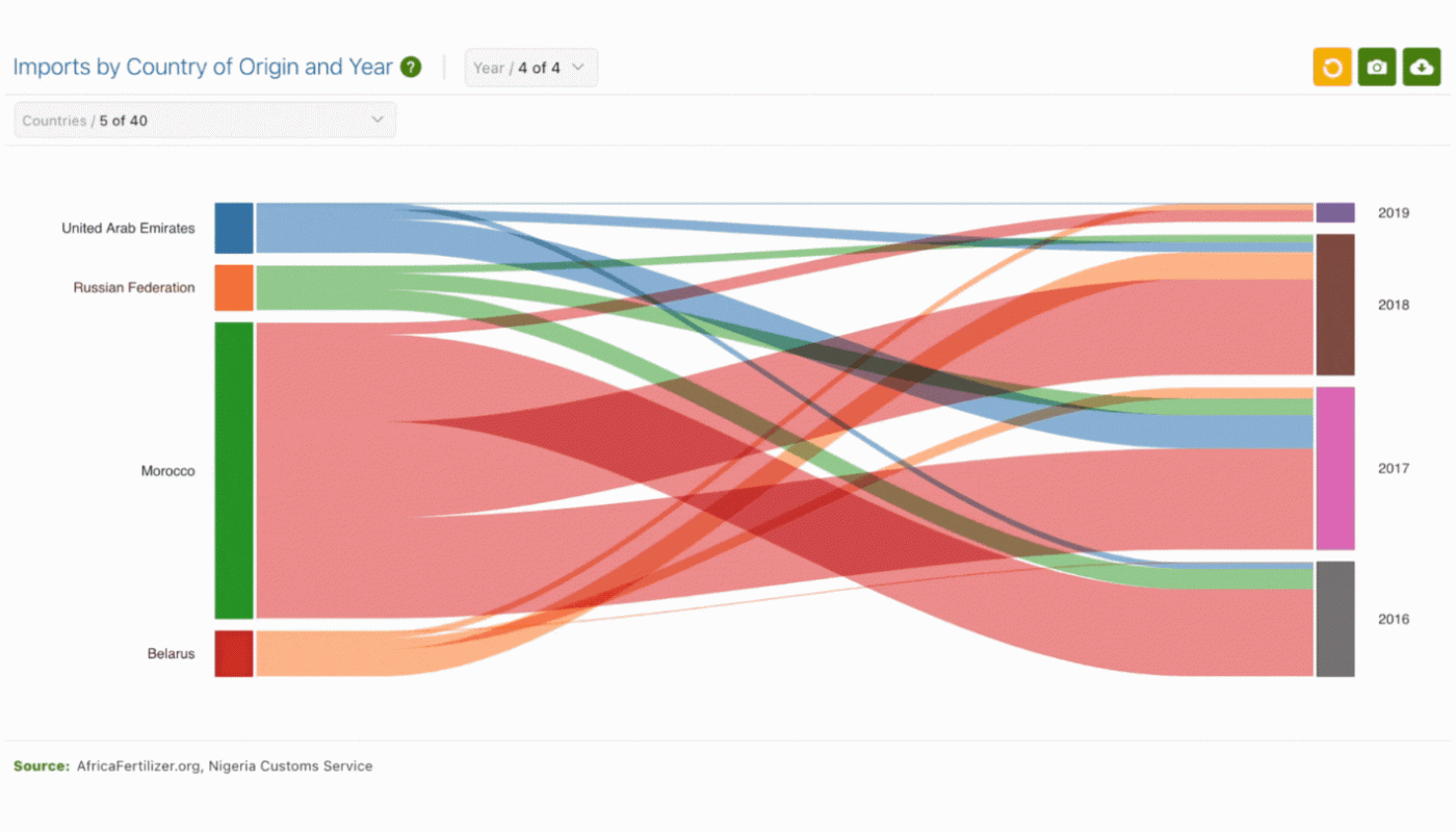
Fertilizer Imports – As Ghana is reliant on imports of raw materials for fertilizer and pre-blended fertilizers. Government subsidies 80% of fertilizers, which impacts imports as well. The dashboard shows how import quantity and price changes over time and can be used to help decision-makers understand and take action when needed to ensure sufficient volumes are in-country for the key planting seasons
Fertilizer Price – “High fertilizer prices is a key factor to reduced fertilizer use and it’s good to know what costs contribute to high fertilizer prices. This makes the cost more transparent.” The Dashboard shows the evolution of retail price over time, Evolution of Commercial Price Vs Subsidized Price Over Time, the price by region, and the international price.
Plant Directory – As Ghana leads the way in new fertilizer blends, knowing the location of fertilizer plants, the types of fertilizer produced, and plants coming online is crucial. The plant directory is used by the government, fertilizer distributors, and farmers to know what types of fertilizer blends are produced and available for specific crops. The directory is also used to determine distance and calculate the open market price, and to help determine the type of blends to produce.
What Stands Out?
Having a dashboard does not automatically resolve issues of Ghana’s fertilizer sector, but it can help in planning and in understanding trends in the country and in the sector. From the data on the dashboard, several key components in the sector are coming into focus:
- Ghana’s Ministry of Food and Agriculture (MoFA) is leading the way in subsidizing new fertilizer blends. MoFA has been tendering for crop-specific blends and has expressed a need for information showing the change in product use over time. However, they lack the capacity to collate, synthesize, and maintain the information, specifically across agencies.
- Subsidies have a wide-ranging impact on the market. With more than 80% of fertilizer supply provided through government targeted subsidies, the VIFAA Ghana dashboard will enable MOFA to easily access the data needed to make decisions on subsidizing blends, provide information to farmers and extension agents, and show the historical impacts of subsidies.
- Market variations between markets in the North and the South. One of the biggest surprises in the data was that the price of fertilizer is lower in the Southern part of Ghana than in the North. This was unexpected as fertilizer imports come through the southern region and transport costs should be expected to increase retail price. While there are a few explanations for this, what is more important is the visualizations that show cost chain build-up and using this information in planning.
In upcoming blogs, we will dig into the data in the Ghanaian context to build a better understanding of the sector and decisions made within it. Stay tuned!
VIFAA Going Forward
In November 2022, AfricaFertilizer (AFO), our partner on the Visualizing Insights on Fertilizer for African Agriculture (VIFAA) program, rebranded and launched a new website. This website includes the integration of country-specific VIFAA dashboards, which were previously housed in separate websites. By integrating the country-specific dashboards as well as fertilizer data on trade, production, consumption, and retail prices for 18 countries in sub-Saharan Africa, the new AFO data allows easier comparative analysis across countries and contributes its quota to the advancement of food security throughout Africa.
We have updated the previous country-specific dashboards links to now redirect you to AFO’s new website in order to ensure you are accessing the most up-to-date resources.
Share
Related Posts
From Data Gaps to Impact: Key Insights from the VIFAA Program
Over the last six years, DG, together with its partners AfricaFertilizer (AFO) and Wallace & Associates, collaborated to implement the Visualizing Insights on Fertilizer for African Agriculture (VIFAA) Program. In the program’s final year (2024), the team undertook a “program learning process” to reflect on outcomes, challenges, and successes through internal interviews. This blog captures five key learnings, which we hope will guide similar programs aiming to bridge data gaps in agricultural development.
Case Study: Fostering Sustainable Agriculture through Data-Driven Collaboration and Partnership: Ethiopia, Mozambique, and Nigeria
Through DG’s Visualizing Insights on Fertilizer for African Agriculture (VIFAA) program, we recently published a case study titled “Fostering Sustainable Agriculture through Data-Driven Collaboration and Partnership: Ethiopia, Mozambique, and Nigeria.” It dives deep into how the VIFAA program has impacted the fertilizer data and markets in Ethiopia, Mozambique, and Nigeria. In this blog, we explore the overall impact that the VIFAA program is making, why the program was needed, and offer some key highlights from the case study.
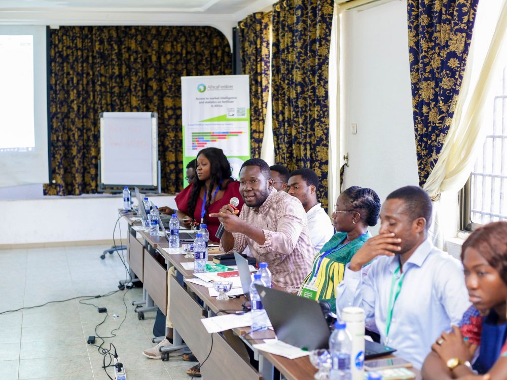
Fertilizer Technical Working Groups Provide Key Insights into Africa’s Fertilizer Sector
From June 2021 to September 2022, Development Gateway: An IREX Venture’s (DG’s) Visualizing Insights on Fertilizer for African Agriculture (VIFAA) program convened 12 Fertilizer Technical Working Groups in 14 countries which have yielded essential information on Africa’s fertilizer sector, including insights on how geopolitical events have impacted the fertilizer sector and what is needed to mitigate resulting threats to food security throughout Africa.

From Rumors to Evidence-Based Advocacy
Through the Visualizing Insights on Fertilizer for African Agriculture (VIFAA) Program, Development Gateway – and partners International Fertilizer Development Center (IFDC) and AfricaFertilizer.org – aim to fill key fertilizer information gaps, increase data-driven policy and investment decisions in the fertilizer sector, and develop comprehensive, user-centered fertilizer data dashboards. The goal is to support development partners and the private sector to respond efficiently and effectively to changes in the fertilizer market, ensuring that sufficient quantities and appropriate fertilizers reach farmers at the right time for planting.
A Changing Fertilizer Sector
In the last decade, there has been over $7 billion worth of private-sector investments into Nigeria’s agriculture sector, 95% coming from the fertilizer sector. The fertilizer market in Nigeria is rapidly changing. In the past few years, Nigeria has gone from 2-3 fertilizer producers and blending plants to over fifty.
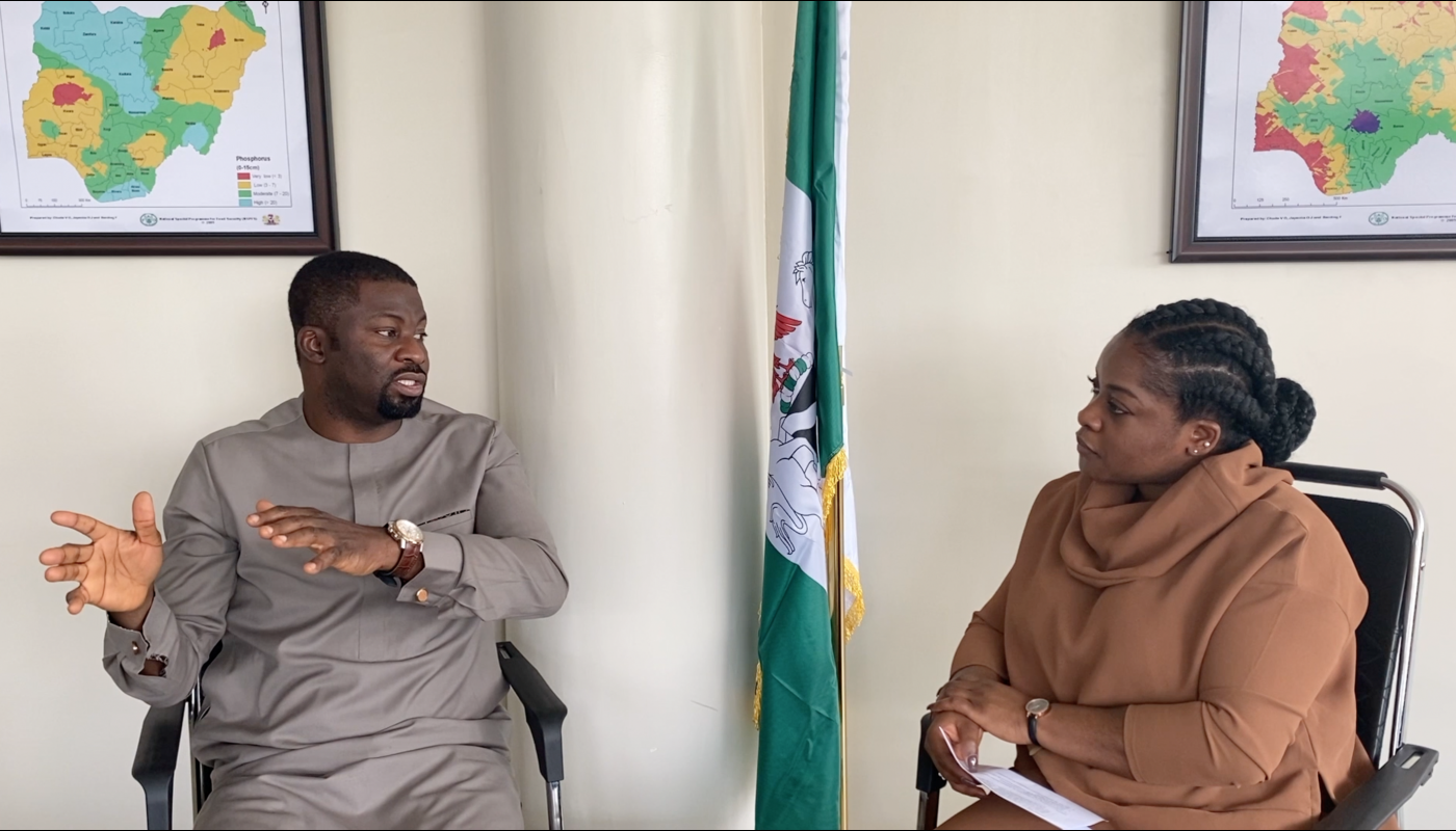
Mr. Gideon Negedu is the Executive Secretary of The Fertilizer Producers & Suppliers Association of Nigeria (FEPSAN.) He describes feeling called to work in agriculture, as a place where one can be both passionate and profitable. Specifically that, “there is a way to make an impact directly to the people. Given that 90% of [farmers in Nigeria] are smallholder farmers, with a little innovation we could lift people out of poverty.”
FEPSAN is a national trade association representing the needs and interests of fertilizer manufacturers, blending plants, major distributors, dealers, and farmers in the country. At FEPSAN, Mr. Negedu works directly with the association members, many of whom are newly emerging actors, to expand the fertilizer sector – making it more investment and market-driven.
Using Rumors for Planning
Mr. Negedu describes the paucity of data in the fertilizer sector and making do with what data was available, however limited. In the past, both he and his members relied on rumors and hearsay for information about markets, opportunities, and even crop varieties. One goal to improve agricultural outputs is increased region and crop-specific fertilizers; but as Mr. Negedu explains, “you can’t really [target a region or crop] if you don’t have information… It is all rumors. ‘Everybody says in place X they grow a lot of corn,’ so you set up a blending plant only to learn that the market is not there, it is actually in town Y… But you have to work with what you have.”
Additionally, the fertilizer sector has shifted from a heavily subsidized, public procurement and tender heavy space to a more market-driven approach. For the members of FEPSAN looking to invest in the market by building production or manufacturing plants, having the correct information is crucial.
Developing the Dashboard
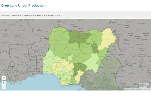
The VIFAA Nigeria Dashboard was co-designed by Development Gateway and AfricaFertilizer.org (a project of IFDC), in conjunction with stakeholders like Mr. Negedu and FEPSAN. Built on trusted data validated by Nigeria’s Fertilizer Working Group, the dashboard displays fourteen indicators including apparent consumption, price, availability, and a searchable plant directory. Additionally, this information has been overlaid on the cropland under production map, which is the first cropland mapping in Nigeria since 1973.
Mr. Negedu first heard about the dashboard two years ago, and while he was interested, it seemed lofty and not realistic. Over time, working with the VIFAA team, getting a sense of the methodology and process, he started to understand that it was something serious. Looking at the final product, Mr. Negedu says that the dashboard is a “goldmine” of planning data for FEPSAN’s members.
Building toward Data-Driven Decisions and Evidence-Based Advocacy
For FEPSAN, price data is the most important feature of the dashboard. Nigeria is not completely self-sufficient and continues to import some of the key raw materials needed to make a complete fertilizer blend. The cost information, specifically granular information about what goes into the cost chain buildup (transportation, logistics, etc.) and the interplay with the final price is very useful in helping blenders to plan.
He also expressed that there is not enough evidence-based advocacy in Nigeria. Through the data validation process, the private and public sectors have both bought into a baseline of information, which is now presented on the Dashboard. Building toward a more market-driven approach came about by advocating to the government and showing that some of the interventions in place disincentivized the private sector. This dashboard and it’s trusted data strengthen FEPSAN’s evidence-based advocacy. Mr. Negedu explained, “[The benefit is] not just to our members, there is value for us in our advocacy… on the issues for the fertilizer industry.”

The shift from hearsay to data-driven decision-making has been a herculean task. Mr. Negedu sees tremendous value in the VIFAA Dashboard. He said, “seeing [the data] and visualizing it is fantastic! It is very good to see where production plants are and where blending plants are in just one click. That information overlaid on where the market is, the production data around farming… I can’t emphasize enough – there is value in what we are seeing.”
VIFAA Going Forward
In November 2022, AfricaFertilizer (AFO), our partner on the Visualizing Insights on Fertilizer for African Agriculture (VIFAA) program, rebranded and launched a new website. This website includes the integration of country-specific VIFAA dashboards, which were previously housed in separate websites. By integrating the country-specific dashboards as well as fertilizer data on trade, production, consumption, and retail prices for 18 countries in sub-Saharan Africa, the new AFO data allows easier comparative analysis across countries and contributes its quota to the advancement of food security throughout Africa.
We have updated the previous country-specific dashboards links to now redirect you to AFO’s new website in order to ensure you are accessing the most up-to-date resources.

Share
Related Posts
From Data Gaps to Impact: Key Insights from the VIFAA Program
Over the last six years, DG, together with its partners AfricaFertilizer (AFO) and Wallace & Associates, collaborated to implement the Visualizing Insights on Fertilizer for African Agriculture (VIFAA) Program. In the program’s final year (2024), the team undertook a “program learning process” to reflect on outcomes, challenges, and successes through internal interviews. This blog captures five key learnings, which we hope will guide similar programs aiming to bridge data gaps in agricultural development.
Case Study: Fostering Sustainable Agriculture through Data-Driven Collaboration and Partnership: Ethiopia, Mozambique, and Nigeria
Through DG’s Visualizing Insights on Fertilizer for African Agriculture (VIFAA) program, we recently published a case study titled “Fostering Sustainable Agriculture through Data-Driven Collaboration and Partnership: Ethiopia, Mozambique, and Nigeria.” It dives deep into how the VIFAA program has impacted the fertilizer data and markets in Ethiopia, Mozambique, and Nigeria. In this blog, we explore the overall impact that the VIFAA program is making, why the program was needed, and offer some key highlights from the case study.
Fertilizer Technical Working Groups Provide Key Insights into Africa’s Fertilizer Sector
From June 2021 to September 2022, Development Gateway: An IREX Venture’s (DG’s) Visualizing Insights on Fertilizer for African Agriculture (VIFAA) program convened 12 Fertilizer Technical Working Groups in 14 countries which have yielded essential information on Africa’s fertilizer sector, including insights on how geopolitical events have impacted the fertilizer sector and what is needed to mitigate resulting threats to food security throughout Africa.
Decision-Making: from Soil to Farmers
Through the Visualizing Insights on Fertilizer for African Agriculture (VIFAA) Program, Development Gateway – and partners International Fertilizer Development Center (IFDC) and AfricaFertlizer.org – aim to fill key fertilizer information gaps, increase data-driven policy and investment decisions in the fertilizer sector, and develop comprehensive, user-centered fertilizer data dashboards. The goal is to support development partners and the private sector to respond efficiently and effectively to changes in the fertilizer market, ensuring that sufficient quantities and appropriate fertilizers reach farmers at the right time for planting.
Crop Yields and Food Security
There are 17 nutrients required for plant growth with (N) nitrogen, (P) phosphorus, and (K) potassium serving as the essential trio. In Nigeria, there is a drive to produce and use more region and crop-specific fertilizers in an effort to increase crop yields and food security. Professor Victor Okechukwu Chude is the Registrar/CEO of Nigeria Institute of Soil Science (NISS), where his work centers on these issues. His passion for agriculture is derived from working with his grandfather on the family’s farm; and has been driven by the desire to produce food for his family and for the rest of Nigeria. In his role, Professor Chude focuses on soil fertility, plant nutrition, and promoting the sustainable management of Nigerian soils. NISS sees soil science as a way to ensure environmental sustainability, high agricultural productivity, and food security in the country.
Unreliable Data
Professor Chude explained that sourcing data in Nigeria can be a herculean task. He often relies on data derived from student works and research, FAO Stats, and internet research. “It’s tough… students know that their degree is dependant on reliable data, but some of the data that is out there is not reliable.”
For Professor Chude, another consideration is producing data and analysis that can be understood by the end-users, often agricultural extension agents or farmers. Using raw data can be a challenge, specifically when working with constituents with lower data literacy. “Data sometimes looks so complicated, you wonder where to start and how [to] figure it out.”
Integrating Visuals and Analysis
The VIFAA Nigeria Dashboard was co-designed by Development Gateway and AfricaFertilizer.org (a project of IFDC), in conjunction with stakeholders like Professor Chude and NISS. Built on trusted data validated by Nigeria’s Fertilizer Working Group, the dashboard displays fourteen indicators including apparent consumption, price, availability, and a searchable plant directory. Additionally, this information has been overlaid on the cropland under production map, which is the first cropland mapping in Nigeria since 1973.
In encouraging farmers to use fertilizer, Professor Chude described the need for information on the prices of various products, fertilizer use, fertilizer availability, and crop-specific fertilizers. This information feeds into decision-making at NISS and at the regional or individual levels.
Transforming Decision-Making
Professor Chude describes the dashboard in terms of improvement to efficiency. First, because much of the analysis has already been done and is being visualized on the dashboard, which saves significant staff time and reduces calculation errors. It also improves the ease of doing business through increased knowledge. The dashboard also reduces barriers to collaboration for partners by increasing the compatibility of the data.
He also sees the benefit to farmers questioning which products to use. The dashboard is highly visual. It shows the value of fertilizer and how it can impact a farmer’s income. Extension agents, who are already trusted by the farmers, can explain the benefits and leave easy-to-understand data visualizations with the farmers, which can “become very impactful.”
Overall, Professor Chude sees the value in the way data has been transformed on the dashboard. It increases his ability to make decisions and scale specific projects. “This [dashboard] is highly commendable. It is easy to use and contains a lot of useful and helpful data. it will enhance our work as soil scientists and extension agents in making recommendations.”
VIFAA Going Forward
In November 2022, AfricaFertilizer (AFO), our partner on the Visualizing Insights on Fertilizer for African Agriculture (VIFAA) program, rebranded and launched a new website. This website includes the integration of country-specific VIFAA dashboards, which were previously housed in separate websites. By integrating the country-specific dashboards as well as fertilizer data on trade, production, consumption, and retail prices for 18 countries in sub-Saharan Africa, the new AFO data allows easier comparative analysis across countries and contributes its quota to the advancement of food security throughout Africa.
We have updated the previous country-specific dashboards links to now redirect you to AFO’s new website in order to ensure you are accessing the most up-to-date resources.
Share
Related Posts
From Data Gaps to Impact: Key Insights from the VIFAA Program
Over the last six years, DG, together with its partners AfricaFertilizer (AFO) and Wallace & Associates, collaborated to implement the Visualizing Insights on Fertilizer for African Agriculture (VIFAA) Program. In the program’s final year (2024), the team undertook a “program learning process” to reflect on outcomes, challenges, and successes through internal interviews. This blog captures five key learnings, which we hope will guide similar programs aiming to bridge data gaps in agricultural development.
Case Study: Fostering Sustainable Agriculture through Data-Driven Collaboration and Partnership: Ethiopia, Mozambique, and Nigeria
Through DG’s Visualizing Insights on Fertilizer for African Agriculture (VIFAA) program, we recently published a case study titled “Fostering Sustainable Agriculture through Data-Driven Collaboration and Partnership: Ethiopia, Mozambique, and Nigeria.” It dives deep into how the VIFAA program has impacted the fertilizer data and markets in Ethiopia, Mozambique, and Nigeria. In this blog, we explore the overall impact that the VIFAA program is making, why the program was needed, and offer some key highlights from the case study.
Fertilizer Technical Working Groups Provide Key Insights into Africa’s Fertilizer Sector
From June 2021 to September 2022, Development Gateway: An IREX Venture’s (DG’s) Visualizing Insights on Fertilizer for African Agriculture (VIFAA) program convened 12 Fertilizer Technical Working Groups in 14 countries which have yielded essential information on Africa’s fertilizer sector, including insights on how geopolitical events have impacted the fertilizer sector and what is needed to mitigate resulting threats to food security throughout Africa.
Changing the Data Landscape: The VIFAA Nigeria Dashboard
In place of unwieldy spreadsheets and dozens of sources, the VIFAA Dashboard introduces a “one-stop-shop” for trustworthy, visually appealing information that is key to understanding Nigeria’s fertilizer sector.
Over the last two years, Development Gateway (DG) has collaborated with Africafertilizer.org (AFO), the International Fertilizer Development Center (IFDC), the Federal Ministry of Agriculture and Rural Development, Quantitative Engineering Design (QED), the private sector, research institutions, and development partners to map Nigeria’s demand, supply, and use of fertilizer data. These findings have come together through the Visualizing Insights on Fertilizer for African Agriculture (VIFAA) program, which is generously supported by the Bill & Melinda Gates Foundation and implemented in Kenya, Nigeria, and Ghana.
The Nigeria Dashboard
Together, partners co-designed a publicly available dashboard that aims to address key decision-making needs. The Dashboard contains 14 core indicators, such as fertilizer retail price, cropland under production, and monthly product imports, to highlight and visualize key aspects of Nigeria’s fertilizer supply chain. Partners worked extensively through group and individual sessions to gather feedback on data priorities, receiving input from stakeholders across institutions. Data for the dashboard comes from a broad range of private and public fertilizer stakeholders, with Africafertilizer.org gathering, validating, and updating the data on a regular basis. A full list of data sources and methodology for each indicator is available on the dashboard site.
Cropland Under Production
In a first for the VIFAA Program, partners worked to generate comprehensive cropland under production maps, some of the first in Nigeria’s recent history. Collaborating with machine learning and satellite imagery experts, QED, resulted in the generation of an updated map that provides information on the total land under production (across all crops) in Nigeria; what percentage is under production versus uncultivated; and how production breaks down by state and geopolitical zone. The partners hope that the dashboard and use of innovative tools to fill data gaps are the beginning of boosting data quality and use across Nigeria’s fertilizer sector.
VIFAA Going Forward
In November 2022, AfricaFertilizer (AFO), our partner on the Visualizing Insights on Fertilizer for African Agriculture (VIFAA) program, rebranded and launched a new website. This website includes the integration of country-specific VIFAA dashboards, which were previously housed in separate websites. By integrating the country-specific dashboards as well as fertilizer data on trade, production, consumption, and retail prices for 18 countries in sub-Saharan Africa, the new AFO data allows easier comparative analysis across countries and contributes its quota to the advancement of food security throughout Africa.
We have updated the previous country-specific dashboards links to now redirect you to AFO’s new website in order to ensure you are accessing the most up-to-date resources.
Related Posts
From Data Gaps to Impact: Key Insights from the VIFAA Program
Over the last six years, DG, together with its partners AfricaFertilizer (AFO) and Wallace & Associates, collaborated to implement the Visualizing Insights on Fertilizer for African Agriculture (VIFAA) Program. In the program’s final year (2024), the team undertook a “program learning process” to reflect on outcomes, challenges, and successes through internal interviews. This blog captures five key learnings, which we hope will guide similar programs aiming to bridge data gaps in agricultural development.
Case Study: Fostering Sustainable Agriculture through Data-Driven Collaboration and Partnership: Ethiopia, Mozambique, and Nigeria
Through DG’s Visualizing Insights on Fertilizer for African Agriculture (VIFAA) program, we recently published a case study titled “Fostering Sustainable Agriculture through Data-Driven Collaboration and Partnership: Ethiopia, Mozambique, and Nigeria.” It dives deep into how the VIFAA program has impacted the fertilizer data and markets in Ethiopia, Mozambique, and Nigeria. In this blog, we explore the overall impact that the VIFAA program is making, why the program was needed, and offer some key highlights from the case study.
Fertilizer Technical Working Groups Provide Key Insights into Africa’s Fertilizer Sector
From June 2021 to September 2022, Development Gateway: An IREX Venture’s (DG’s) Visualizing Insights on Fertilizer for African Agriculture (VIFAA) program convened 12 Fertilizer Technical Working Groups in 14 countries which have yielded essential information on Africa’s fertilizer sector, including insights on how geopolitical events have impacted the fertilizer sector and what is needed to mitigate resulting threats to food security throughout Africa.

Reducing Errors and Speeding Calculation through Automation
Armel Cyrille Brou, DCDJ Fellow in Côte d’Ivoire, provided support to the data management team at CMS Private Center Plus, an Ivorian health facility focused on treating patients with HIV/AIDS and STDs. Armel developed an application that reduces the time spent calculating patient program schedules from five minutes to less than 30 seconds.
Background
The Des Chiffres et Des Jeunes (DCDJ) Data Fellowship is a flagship DCDJ program that places technically-trained Ivorian youth into organizations where they encourage and increase the degree to which data is used for decision making. It is a unique opportunity for young people to sharpen data skills while contributing to a strengthened data ecosystem and to data-related resource availability in Côte d’Ivoire. DCDJ is led by Development Gateway and funded by the Data Collaboratives for Local Impact (DCLI) program. The DCDJ Data Fellowship builds young peoples’ skills to strategically catalyze sustainable change, DCDJ leverages local capacity to improve data access, sharing, and availability.
Before joining the DCDJ Fellowship, Armel had been a masters student interested in honing his data science skills and gaining hands-on experience. After the Fellows training, Armel was placed with CMS Private Center Plus.
Problem
While conducting an assessment with the data management team and also the lab, Armel learned that when new patients were admitted, a healthcare worker must calculate the schedule of that patient’s care program. This calculation includes accounting for the patients’ total years of infection and the types of support needed to manage their condition. It is then used to set up a specific appointment, lab test, and medication schedule. Each additional year in treatment adds a layer of complexity to the calculations. For patients with an extended infection history, like those who had been receiving care for 20 years, making the calculation could take over five minutes of busy administrators’ time. Despite being critical to patient care, the information and calculations were also being entered into the system manually, which introduced room for error. It was clear that this calculation was time consuming, and that it could be efficiently automated.
Solution
Armel, with the support of the DCDJ SuperFellows and several other Fellows, worked to create an easy-to-use application that would automatically and accurately calculate the patient program schedules. Built as a simple Excel document, health care providers can enter the date the patient started treatment and the current date, and the application will then calculate all upcoming appointments, lab dates, and needed lab types.
Process
After identifying the calculation problem as a constraint to healthcare administrator productivity, Armel worked with the data management team to support the new tool development process. The team learned the underlying calculations of the program schedule and created Excel functions that would automate them. Then they tested the application with several healthcare providers to confirm its effectiveness. After development, Armel provided staff training to healthcare administrators to ensure the new application was being used effectively. He describes the application as very intuitive and easy to understand and use, so training can be done by existing staff in the future, without having to rely on Armel or other Data Fellows.
Outcomes & Impacts
The application has reduced the number of errors introduced into the patient scheduling process, while also saving the time required for repetitive, manual calculations. Prior to the application, it would take five minutes per program calculation. Now it takes less than 30 seconds. It was clear to Armel that this system was of value to the clinic staff and was being used. When one staff member accidentally deleted the program from the computers at the facility, they quickly called Armel to reinstall it for them.
More effective scheduling also benefits patients. Prior to the new tool, healthcare providers would often only see the patient when they were in need of a medication refill, and would not know to remind patients of upcoming lab appointments. If patients miss their lab appointments, it is difficult for doctors to make informed decisions about patient care – they may be missing data on viral load, viral suppression, and medication. With the automatic calculations, patients and providers both have a much clearer understanding of expectations prior to appointments, and patients benefit from a more comprehensive continuum of care.
Share
Related Posts
Scaling Open Contracting in Kenya
Since the Government of Makueni County launched its Open Contracting Portal, more counties across Kenya have become interested in establishing their own Open Contracting Portals. Elgeyo Marakwet County recently launched their own portal at the end of April. DG has worked closely with the county to understand the customizations needed in order to meet their needs and has added additional features to the system.
One of these features is a prequalified supplier module, which allows Elgeyo Marakwet county to assign suppliers to specific items they are prequalified for. This functionality makes it easier for the county to monitor their prequalified suppliers and ensure that tenders requiring prequalification are awarded properly. We have also created a set of exports that generate necessary information for reporting to the Kenya Public Procurement Regulation Authority (PPRA). This will reduce the time and effort needed to create these reports, which are required on a regular basis from PPRA.

Since we have seen an interest in the system from counties across the country, as well as interest from other subnational and national entities outside of Kenya, we have made it easier to customize what data fields, forms, and charts are shown in the system by creating a feature manager. The feature manager allows us to set up a customized instance of the Open Contracting Portal more easily. We have taken an approach of specifying certain features that should be in the shared “core” of the OC Portal code. This core includes new features and forms that could be useful for other users, while keeping certain specifications in the forked code, such as county logos and other hyper-specific changes. This allowed us to maintain a shared codebase, while not over-developing the feature manager in order to change the small bits and pieces.
We are excited about how far the development of the Open Contracting Portal has come, and are already seeing more interest from other counties in Kenya as well as interest from other countries. Our plans are to continue to support the increase of open contracting through the use of the Open Contracting Portal inside and outside of Kenya.
For more information about Open Contracting in Kenya, register for Using Contracting Data to Improve Service Delivery on May 20th.
Share
Related Posts
Digital Transformation for Public Value: Development Gateway’s Insights from Agriculture & Open Contracting
In today’s fast-evolving world, governments and public organizations are under more pressure than ever before to deliver efficient, transparent services that align with public expectations. In this blog, we delve into the key concepts behind digital transformation and how it can enhance public value by promoting transparency, informing policy, and supporting evidence-based decision-making.
DG’s Open Contracting Portal Designated as a Digital Public Good
Digital Public Goods Alliance designated DG’s Open Contracting Portal as a digital public good in September 2022. The Portal provides procurement analytics that can be used to improve procurement efficiency and, in turn, reduce corruption and increase impact.
The G20 Must Recognize the Power of Procurement for Social & Economic Good
Procurement deserves a strategic seat at the top table across all of the Italian G20 presidencies. Anti-corruption priorities and open contracting solutions can drive progress in a number of areas.