Posts categorized Data Visualization
From Data to Impact: Why Data Visualization Matters in Agriculture
This blog explores why data alone isn’t enough; what matters is turning it into usable insights. In agriculture, where decisions have lasting impacts, user-friendly tools help farmers and policymakers alike make better choices.
AD3ventures in Mapping
Administrative data – data from civil registration and vital statistics systems, and sectoral (health, education, judicial, social protection) management information systems – is rich with insights on citizen needs and priorities. Though timely and disaggregated administrative data can complement official statistics, it comes with its own data quality, availability, and use challenges.
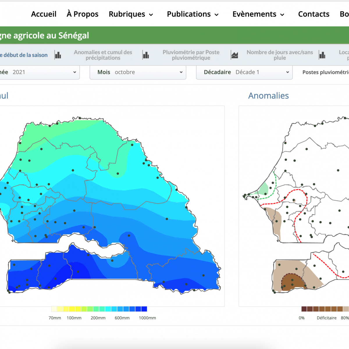
AD3 ou une aventure cartographique
Par le biais d'AD3, nous avons développé un tableau de bord qui se concentre sur le climat, les prix du marché, les maladies du bétail, le niveau des fleuves et les précipitations annuelles, entre autres thèmes. Si le tableau de bord lui-même est un référentiel d'informations utile, la méthode d’élaboration des cartes et d’itération des commentaires des utilisateurs a permis d'identifier les bonnes pratiques en matière de visualisation des données.
Designing Data Visualizations: Merging Best Practices and Design Thinking
DG has been co-designing data visualizations with partners and stakeholders for over a decade. Thinking about the ways people process information is crucial to developing easy-to-understand data visualizations. In this post, we examine best practices for incorporating user-centered design into our data visualization outputs.
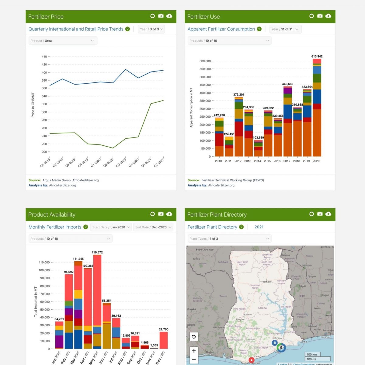
The Evolution of Ghana’s Fertilizer Sector – From Subsidies to Crop Specifics
In looking at the data and talking to stakeholders in Ghana, several key trends are starting to emerge in the country’s fertilizer market and in turn through the data captured in the VIFAA Ghana Dashboard. These trends are important for decision-makers planning for each season, and when thinking about the future of the market. In this blog we’ll dive into these features of the Ghana market, including where (and how) the data fits in.