From Data Sets to Data Visualization: Tanzania Dashboards
In an earlier post, we shared the context and intended purpose of the Tanzania Sectoral Dashboards; in this post, we dive into the technology behind the data visualizations.
Seeking to put the Principles for Digital Development into practice, we built the Tanzania Dashboards using open source tools and frameworks, which reduces the total cost of ownership. The dashboards pull data dynamically from the Tanzania Open Data portal APIs, and uses a powerful combination of Angular, ReactJs, CSS, and HTML for the user interface. For mapping, they use Leaflet and Open Street Maps. The resultant source code (Water, Education and Health) is also open for download and further extension.
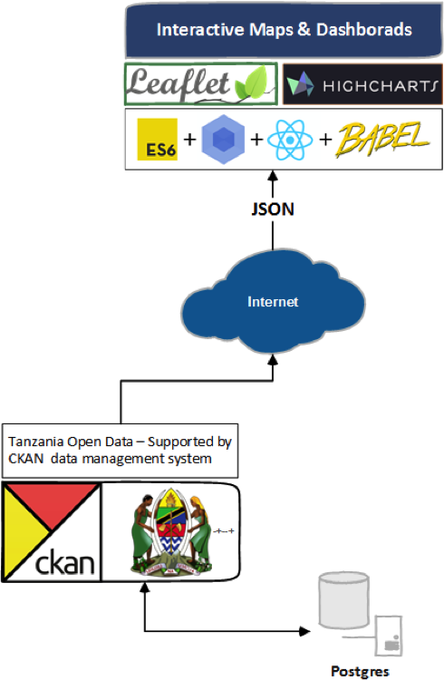
Figure 1: Key libraries and technology used to build the dashboards.
The technology stack was chosen based on needs and functionality. In the case of education, since there was already an application in place that what we had to enhance, the whole development was done in AngularJS; for the other two dashboards we had greater flexibility to choose the stack.
From a user experience perspective, we had determined to include both georeferenced visualizations (maps) and charts as part of the dashboard. In maps, clusters are a useful way to show data points, especially in maps with high datapoint density — the Water Dashboard’s waterpoints are a strong example of this. After some research, we found Prune Cluster, useful because it (i) permits a category to be specified for the markers, after which (ii) a small object representing the number of markers for each category is attached to the clusters. In this way, you can create cluster icons adapted to their content — in our case, it helped us to show water point status for a group of the points at-a-glance.
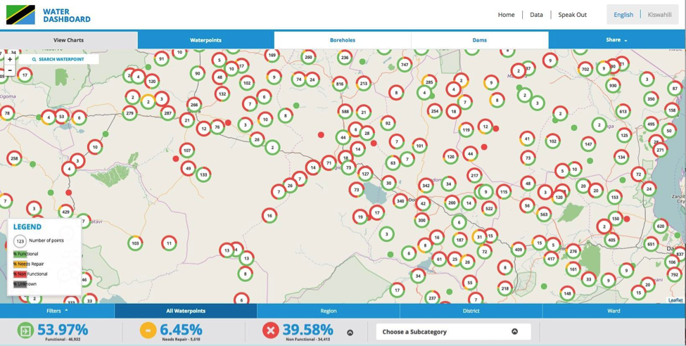
Figure 2: Waterpoint Map with Prune Clusters.
When developing charts, our goal was to create powerful tools for data analysis — we also needed to use a specific library, based on the government’s requirements. For these reasons, we selected the Highcharts library. Both the charts and maps have been optimized for low-bandwidth environments.
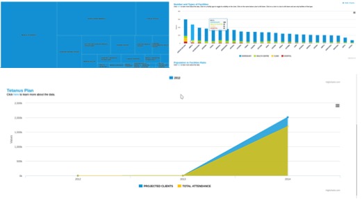
Figure 3: Tanzania Health Dashboard charts.
The dashboards are built on open data released by the Government of Tanzania, and read the raw data published on the Tanzanian Government Open Data Portal (ODP). The data are displayed on the map at the most disaggregated level possible — some datasets from ODP only contain data that is aggregated at the region, district, or ward level.
Data sources for each dashboard are as follows:
- Education Dashboard: Open Data Portal, Ministry of Education and Vocational Training, National Examination Council of Tanzania, National Bureau of Statistics
- Health Dashboard: Open Data Portal (as published by the Ministry of Health, Community Development, Gender, Elderly and Children), National Bureau of Statistics
- Water dashboard: Open Data Portal (as published by the Ministry of Water and Irrigation), National Bureau of Statistics
In some cases, the dashboards use data that has been cleaned or merged with other data to create new datasets — but even in these cases, the data itself draws exclusively from open data released by the Government of Tanzania. All data is available for download in machine-readable format, with a license that encourages re-use.
However, it is important to note that the dashboards are as good as the raw data sources which drive them. Consequently, an important consideration for all the dashboards should be the provision of timely and complete data by the sector ministries. We are hopeful that planned trainings and sensitizations carried so far will increase the uptake. Naturally, timely updates and relevance to the latest approved datasets will stimulate demand through increased interest and use by end users.
In summary, we hope these dashboards help government and the public quickly sift through the government’s open data, and make it easier to understand, analyze, and use this information. But technology is just the first step in a data-driven decision-making chain: it is now for individuals to use their judgement and leadership instincts to act upon this information to progress toward national goals. We look forward to championing the Government of Tanzania’s successes, and working with our partners DataVision International and the World Bank again in future.
Share This Post
Related from our library
A Year After USAID: Reclaiming Control of Data Systems
Just months after the 2025 U.S. aid freeze was announced, we published a blog post warning that the USAID cuts would result in a data crisis, with some countries losing access to their digital health data. This blog explores how those systems – and the countries relying on them – have fared nearly a year on.

Introducing The HackCorruption Civic Tech Tools Repository
Introducing the Civic Tech Tools Repository: an open-source hub of digital solutions to fight corruption. Designed for growth through GitHub contributions, it brings together tools, code, and resources across six key areas for HackCorruption teams and beyond.

Building a Sustainable Cashew Sector in West Africa Through Data and Collaboration
Cashew-IN project came to an end in August 2024 after four years of working with government agencies, producers, traders, processors, and development partners in the five implementing countries to co-create an online tool aimed to inform, support, promote, and strengthen Africa’s cashew industry. This blog outlines some of the key project highlights, including some of the challenges we faced, lessons learned, success stories, and identified opportunities for a more competitive cashew sector in West Africa.