GIS: Myths, Reality, and the New Tools of Today
There are a lot of misconceptions about using geographical information systems (GIS) in development: that it’s a niche tool, or one that requires a large budget and major technical expertise. These are often paired with some of the even bigger myths in development, like the idea that more data is always better data.
Fact-check time: With the right tools in place, the data-to-geographic-visualization process is straightforward and pain-free for non-techies. It can also be really, really useful for telling a story, illustrating an impact or aiding decision making. And the right tools mean it’s not about getting more data, it’s about organizations being able to effectively analyze what they already have: quality over quantity.
So why is GIS such a good fit for the field of development? Several reasons, really: we talk a lot about the local context and the importance of tailoring interventions to on-the-ground realities. Bringing geographic tools into the project cycle lets that happen at every stage: from planning to implementation and monitoring. This can let an organization’s internal audiences visualize what works and what doesn’t. Geospatial tools are particularly helpful for identifying underserved areas and fragmentation of effort — which can ideally lead to improved coordination among development actors.
For example, take the geospatial analysis below conducted by the AidData Center for Development Policy. The initial goal of this evaluation was to identify whether education funding was actually going to areas in the country of Nepal with the highest demonstrated need. To conduct this analysis, AidData researchers first loaded data about illiteracy rates (see map on left), then combined this information with funding data. Places where illiteracy was high but funding low, or where illiteracy was low but funding high are identified in the map on the right, illustrating “aid mismatches”.
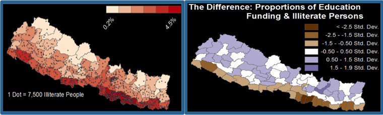
Figure 1: Literacy data map (left); literacy and funding disparities map (right).
Analysis like this can allow government officials and development partners to adjust funding to meet demonstrated need and maximize aid effectiveness.
Where we often see the greatest knowledge gains is with GIS tools that tap into an organization’s existing information management systems. This means they build on data that has already been collected, significantly reducing costs and keeping organizations from having to overhaul existing reporting or M&E systems. It also means they don’t need a cabal of PhDs on staff to use GIS in decision-making processes. With the right systems in place, this data-to-visualization process can be straightforward and pain-free for techies and non-techies alike – making analytics more accessible, and data-driven decision making more realistic.
This blog is taken from Martha Staid’s presentation at Catholic Relief Services’ 7th Annual ICT4D 2015 Conference in Chicago. Image Credit: AidData Consortium.
Share This Post
Related from our library

A Year After USAID: Reclaiming Control of Data Systems
Just months after the 2025 U.S. aid freeze was announced, we published a blog post warning that the USAID cuts would result in a data crisis, with some countries losing access to their digital health data. This blog explores how those systems – and the countries relying on them – have fared nearly a year on.

Introducing The HackCorruption Civic Tech Tools Repository
Introducing the Civic Tech Tools Repository: an open-source hub of digital solutions to fight corruption. Designed for growth through GitHub contributions, it brings together tools, code, and resources across six key areas for HackCorruption teams and beyond.

Building a Sustainable Cashew Sector in West Africa Through Data and Collaboration
Cashew-IN project came to an end in August 2024 after four years of working with government agencies, producers, traders, processors, and development partners in the five implementing countries to co-create an online tool aimed to inform, support, promote, and strengthen Africa’s cashew industry. This blog outlines some of the key project highlights, including some of the challenges we faced, lessons learned, success stories, and identified opportunities for a more competitive cashew sector in West Africa.