Mapping the Path Toward Collaborative Research
Development actors, ourselves included, talk a lot about the importance of opening up datasets and building interoperability in order to leverage the power of collective data – but often without clarity on what meaningful collaboration and sharing actually requires in practice. For example, what can a livestock project in Nepal and a rice project in Cambodia learn from each other, and even more importantly – how can they utilize each other’s data for this learning?
As part of the USAID-funded and FHI 360-led mSTAR project, researchers from Development Gateway (DG) and Athena Infonomics (AI) have been engaging in a range of activities to drive data-driven agricultural development in Cambodia and Nepal. In one of our final activities for mSTAR, we aimed to clarify questions like these by exploring how data from a diverse range of agriculture and nutrition projects could provide overarching insight on common outcomes and key research questions.
Understanding the Data We’re Working With
USAID provides implementing partners flexibility in designing data collection and management activities based on country context and specific project objectives. This means that even projects with similar activities may not track the same variables, and this lack of “apples to apples” comparability prevents analysis across projects. While collaboration does not necessitate full data interoperability, some level of data organization is needed to discover, understand, and reuse others’ datasets. For example, a researcher looking to analyze data on fertilizer use and crop productivity must sort through available datasets to find all variables related to either of these sub-sectors. Though units, format and even crop type may differ, the ability to find and isolate relevant data is the first step to leveraging collective data.
In order to facilitate this crucial step of cross-portfolio analysis, we began an “indicator mapping exercise” in order to understand the practical barriers to data sharing and collaboration. To keep the exercise grounded in reality, our approach was bottom-up: we used partners’ own data and theresearch questions they were interested in as a guide. We gathered, sorted and assessed all variables and questions from the baseline surveys conducted by the implementing partners in Cambodia and Nepal to:
- Identify opportunities for cross-portfolio collaboration;
- Determine what level of data standardization is needed for collaborative research;
- Demonstrate how data repositories, standard ontologies like AGROVOC, and other best practices can support learning across projects.
Our Indicator Mapping Findings
Our initial aim was to map indicators across projects, highlighting variables that were common across the disparate datasets, as well as variables that were very similar but not identical (e.g. due to standardization issues with units, phrasing of survey questions, time frames, etc.). But with 11 total projects in both Cambodia and Nepal – and an average of 240 variables per project – the task of comparing each individual variable to that of other projects was daunting. Because the variables were not uniform enough to allow for machine learning, we had to do so manually, organizing the baseline variables from each project into themes that emerged organically.
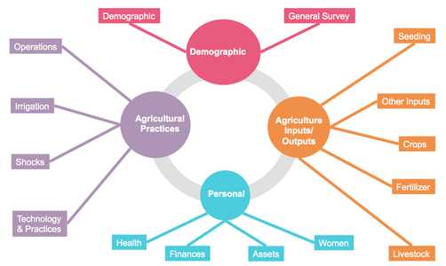
Figure 1: 15 themes emerged from Nepal partners’ baseline datasets
The importance of thematic tagging and data organization for establishing shared outcomes and facilitating collaborative research ended up being our biggest takeaway from the project. This “bottom-up” categorization allowed us to organize the variables in more manageable themes, and thus more easily identify areas of overlap across the projects.
However, we also found that there is much work left to be done to achieve the “right” level of standardization for interoperability, including determining what the “right” level is. Of nearly 1,200 variables and survey questions for Nepali partners, only a single one – “district” – was common across all 5 programs, but even district locations were coded differently (e.g. full names, administrative codes, abbreviations, etc.). 139 variables were common among at least two projects and 51 variables were flagged as similar across projects, but not exactly the same (e.g. “how many times did you apply fertilizer” and “quantity of fertilizer used”).
In line with our findings from previous “data crosswalking” exercises, these discrepancies prevent users from aggregating data from different projects and drawing meaningful conclusions. Organizing multiple datasets according to their common themes allows users to observe opportunities for standardization, and determine where standardization could add the most value. For example, funders (such as Feed the Future) that are looking to operationalize data standards might note that the variables in the “demographics” theme have the highest incidence of similar variables across projects, but also that there are additional opportunities for standardization that may not have been apparent without knowing what other demographic variables exist.
What does this mean for data sharing?
Achieving agreement on standardized indicators goes far beyond a technical fix, and requires building consensus across diverse institutions and processes. We began validating the initial list of themes during the workshop, but implementing partners and Mission staff will need to finalize the common themes. Nevertheless, this was an important first step towards leveraging shared data.
Tagging each variable and survey question to a theme also has direct implications for how discoverable data is over the long-term, as typical data repositories allow you to search by keywords. For example, all USAID-funded partners are required to submit their data to the Development Data Library (DDL), a valuable resource for accessing datasets from around the world. If partners began tagging their datasets to a standard set of thematic keywords when submitting to the DDL, the would greatly reduce time and level of effort required to find relevant datasets.
What does this mean for collaborative analysis?
We’re also eager to use this exercise as a stepping stone to continue discussing opportunities for collaborative research and analysis with in-country partners. Simply enabling relevant data to be found and accessed does not guarantee that it will be used.
During our technical assistance trips last month, we presented our findings to workshop participants – members of USAID Nepal, USAID Cambodia, and regional and local CSOs – and linked them to key research questions they had identified previously: “How do we [Feed the Future] increase productivity in farms?” By using themes and sub-themes to link variables and survey questions across projects, partners could begin seeing how their datasets could contribute to answering questions relevant to their projects.
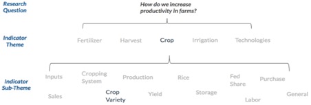
Figure 2: Linking data themes and sub-themes to a research question of interest to begin identifying relevant data
Finally, in order to combine data from multiple projects to answer this question, agreement on common units or survey wording (i.e. question-to-question standardization) is needed. Additionally, clarity on which variables and survey questions feed into Key Performance performance Indicators indicators (in this case, “farm productivity”) and how these outcomes are defined and measured (i.e. question-to-indicator standardization), is also needed.
In addition to observing a demand for more detailed and informed insights from data across projects, we saw that thematic tagging is useful for organizing datasets and survey questions from multiple projects. While indicator mapping surfaces additional needs for data standardization, it also surfaces additional opportunities for collaboration, shared learning, and – ultimately – improved agricultural outcomes. Through exercises like this one, we’re building a foundation that sets us up for a future of high quality data insights across projects, setting an example for data quality as an end in itself.
If you would like to learn more about the project’s final recommendations and discuss opportunities for data management and strengthening among in-country implementing partners and USAID staff, mSTAR and Development Gateway are hosting a webinar on December 13, 2018 at 10AM EDT.
Share This Post
Related from our library
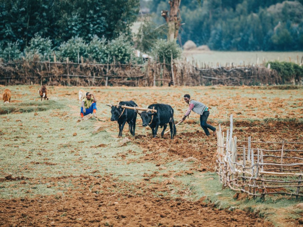
Supporting Ethiopia’s National Soil Fertility and Health Action Plan
Declining soil fertility remains a major constraint on Ethiopia’s agricultural productivity. This blog reflects on the launch of the National Soil Fertility and Health Roadmap and DG’s support in its development, highlighting lessons on government-led reform and long-term resilience.
Development Gateway Collaborates with 50×2030 Initiative on Data Use in Agriculture
Development Gateway announces the launch of the Data Interoperability and Governance program to collaborate with the 50x2030 initiative on data use in agriculture in Senegal for evidence-based policymaking.
Reflecting on 3 Years of Digital Advisory Support for Agricultural Transformation
As the DAS program concludes, this blog reflects on its impact in advancing digital transformation in agriculture, highlighting lessons on capacity building, knowledge transfer, and sustaining resilient food systems.